Category: Kitchen

  • Top 10 Inspiring Black Kitchen Cabinet Designs

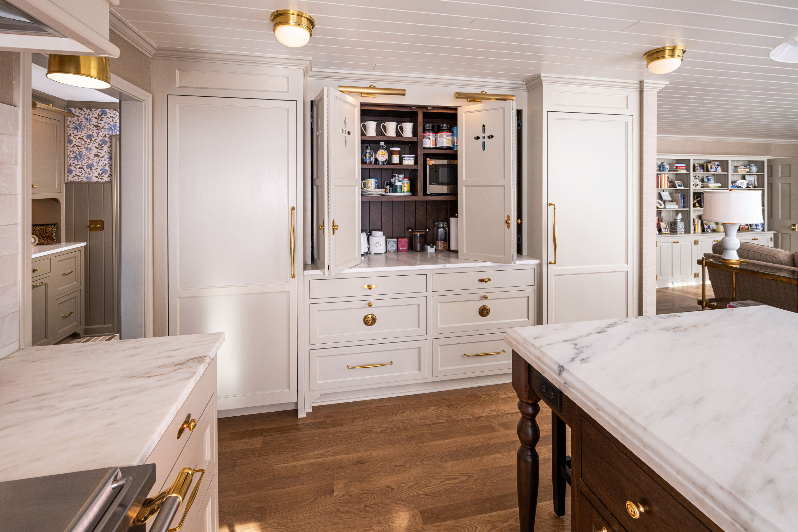
    Ready to break those “black makes rooms feel smaller” design rules? Trust me, your kitchen is about to get a major glow-up!

    Black cabinets are totally having their moment, and they’re nothing like your grandma’s dark, dreary cupboards. From sleek matte finishes that laugh in the face of fingerprints to glossy surfaces that sparkle like your favorite party dress, these 23 styles will blow your mind.


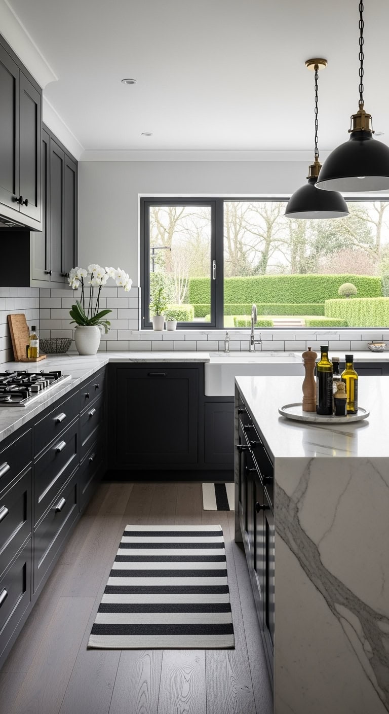
    1.Modern Minimalist: Sleek Black Cabinets With Handle-Free Design

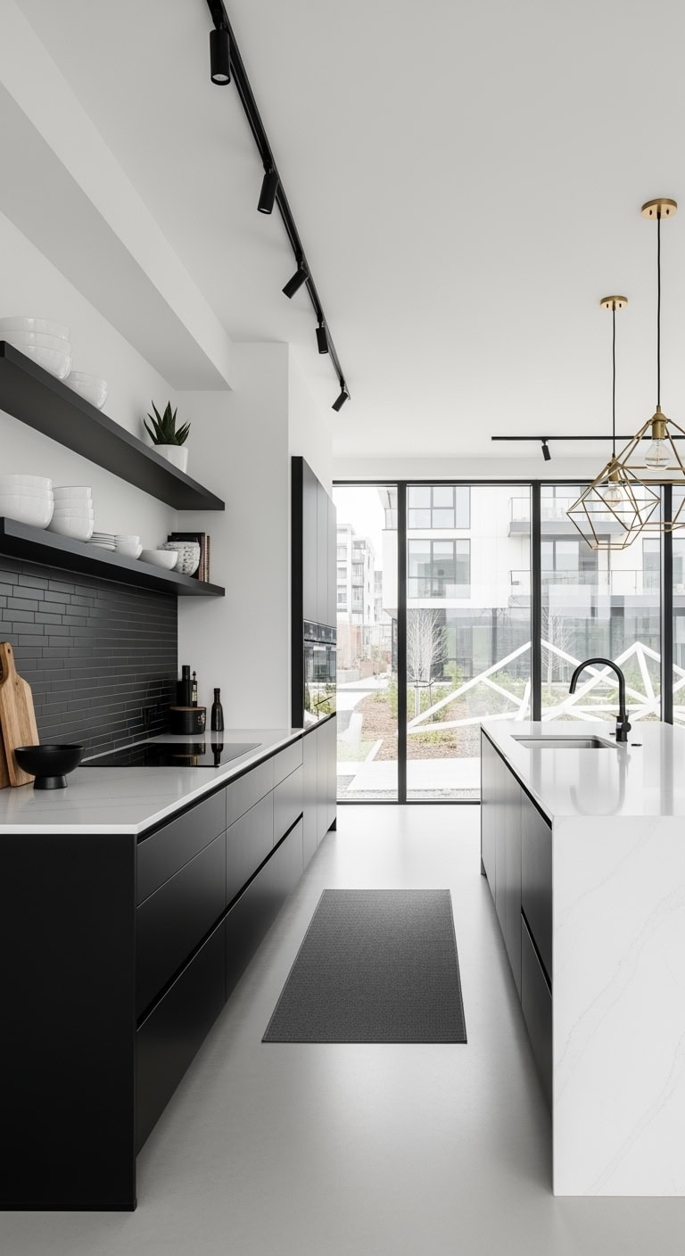
    That clean-lined look from your favorite minimalist coffee shop, but in your kitchen. Handle-free black cabinets create this floating effect that makes even tiny spaces feel twice as big—like wearing all black but for your kitchen.

    DIY Paint Transformation

    • Existing cabinet refresh: Benjamin Moore “Black Beauty” (2128-10) in matte finish for that velvety, fingerprint-hiding surface that looks custom
    • Wall pairing perfection: Sherwin Williams “Pure White” (SW 7005) on walls with Benjamin Moore “Iron Mountain” (2134-30) on the island for depth

    Budget Range: $18,000-$28,000 | Timeline: 4-5 weeks | Best For: Open-concept lofts and modern homes.


    2.Industrial Chic: Matte Black Cabinets With Exposed Metal Hardware

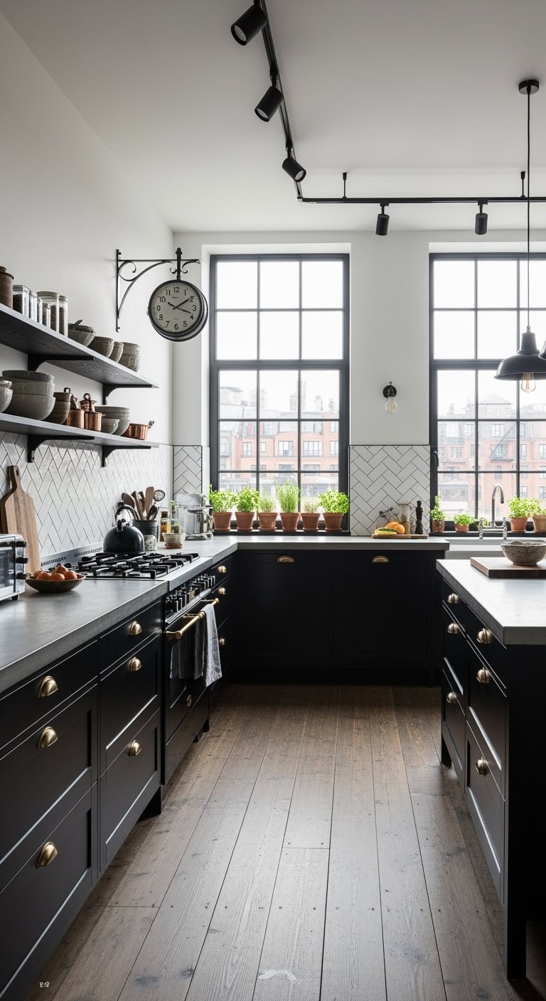
    That loft-style kitchen you keep saving on Instagram? Totally achievable without the downtown price tag. Matte black cabinets paired with raw metal touches create that coffee shop aesthetic where exposed brick meets modern minimalism—basically your favorite brunch spot, but at home.


    DIY Paint Transformation

    • Cabinet refresh: Benjamin Moore “Black Beauty” (2128-10) in matte finish for that perfect charcoal-black depth without going too stark. Sand thoroughly and use a deglosser first.
    • Wall complement: Sherwin Williams “Iron Ore” (SW 7069) for an accent wall behind open shelving, paired with “Agreeable Gray” (SW 7029) on remaining walls for warmth.

    Budget Range: $18,000-$28,000 | Timeline: 3-4 weeks | Best For: Open-concept spaces with high ceilings


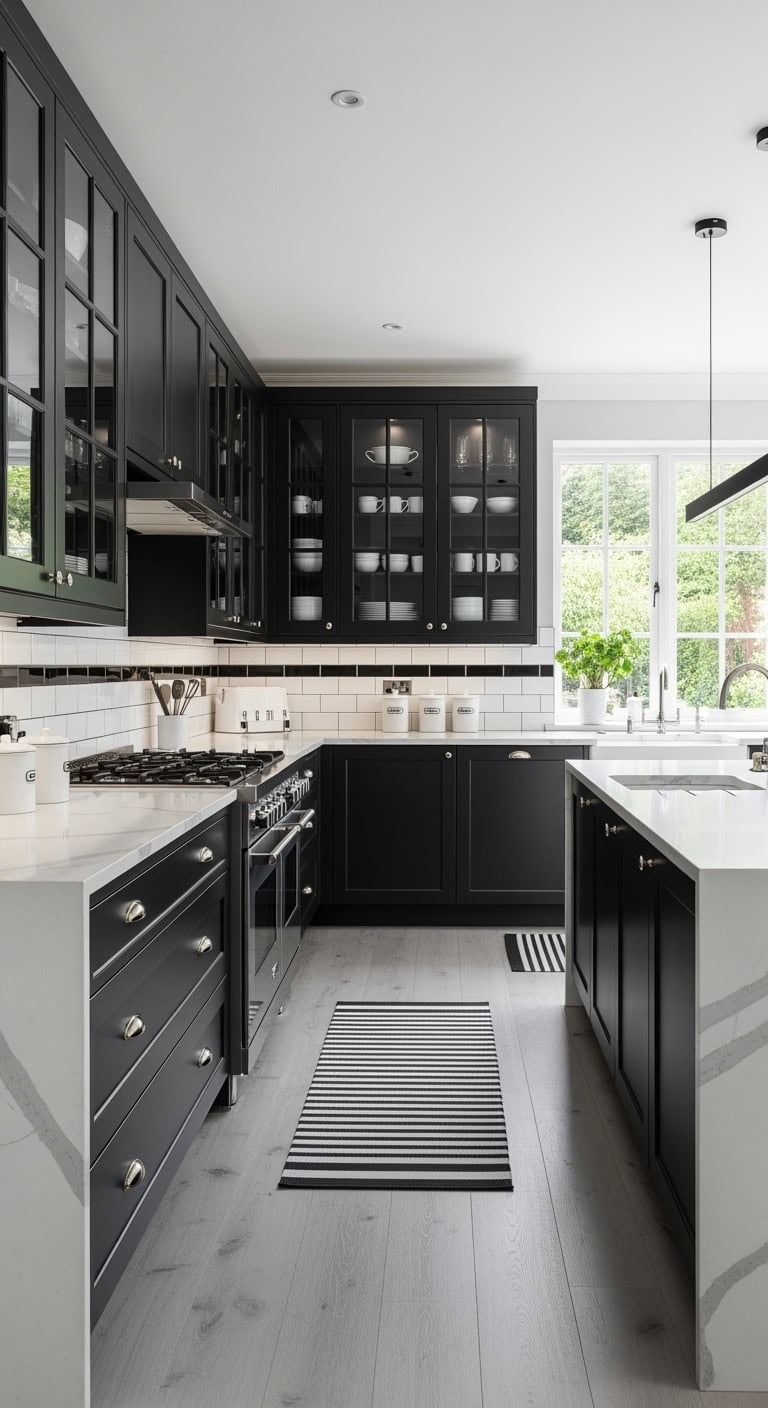
    3.Two-Tone Contrast: Black Lower Cabinets With White Upper Cabinets


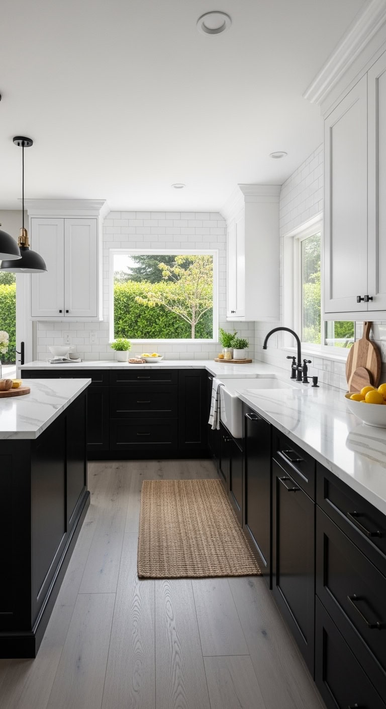
    Like that perfect black dress paired with crisp white sneakers, this combination never goes out of style. Two-tone kitchens give you the grounding effect of black without the cave-like feeling, perfect for scrolling through recipes on your tablet while meal prepping.


    DIY Paint Transformation

    • Lower cabinet refresh: Transform existing lowers with Benjamin Moore “Black Beauty” (2128-10) in satin finish for durability and easy cleaning
    • Upper cabinet brightening: Paint uppers in Benjamin Moore “Simply White” (OC-117) for that Instagram-worthy brightness that makes dishes look amazing

    Budget Range: $18,000-$28,000 | Timeline: 3-4 weeks | Best For: Galley kitchens and homes with limited natural light


    4.Luxe Gold Accents: Black Cabinets With Brass Hardware and Fixtures

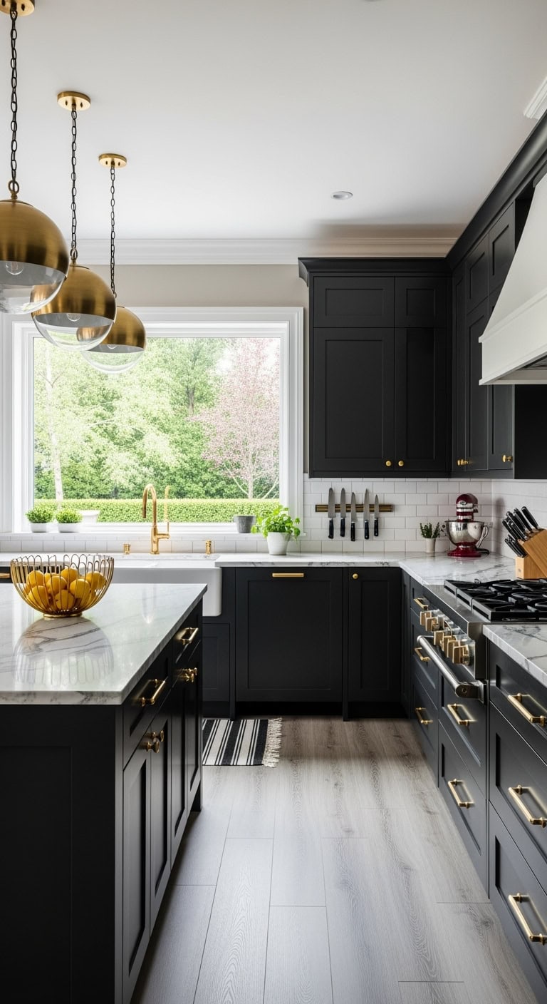
    That little black dress energy but for your kitchen—black cabinets with gold hardware is having its moment and for good reason. It’s giving luxury hotel vibes without the trust fund requirement. Like your favorite gold jewelry against a black sweater, this combo just works every single time.


    DIY Paint Transformation

    • Cabinet refresh: Benjamin Moore “Black Beauty 2128-10” in satin finish for that perfect not-too-shiny black. Sand, prime with Kilz, then two coats for professional results.
    • Wall magic: Sherwin Williams “Accessible Beige SW 7036” keeps things warm, or Clare Paint “Current Mood” for a sophisticated greige that makes brass pop.

    Budget Range: $18,000-$28,000 | Timeline: 3-4 weeks | Best For: Galley kitchens and compact spaces


    5.Scandinavian Inspired: Black Shaker Cabinets With Light Wood Countertops

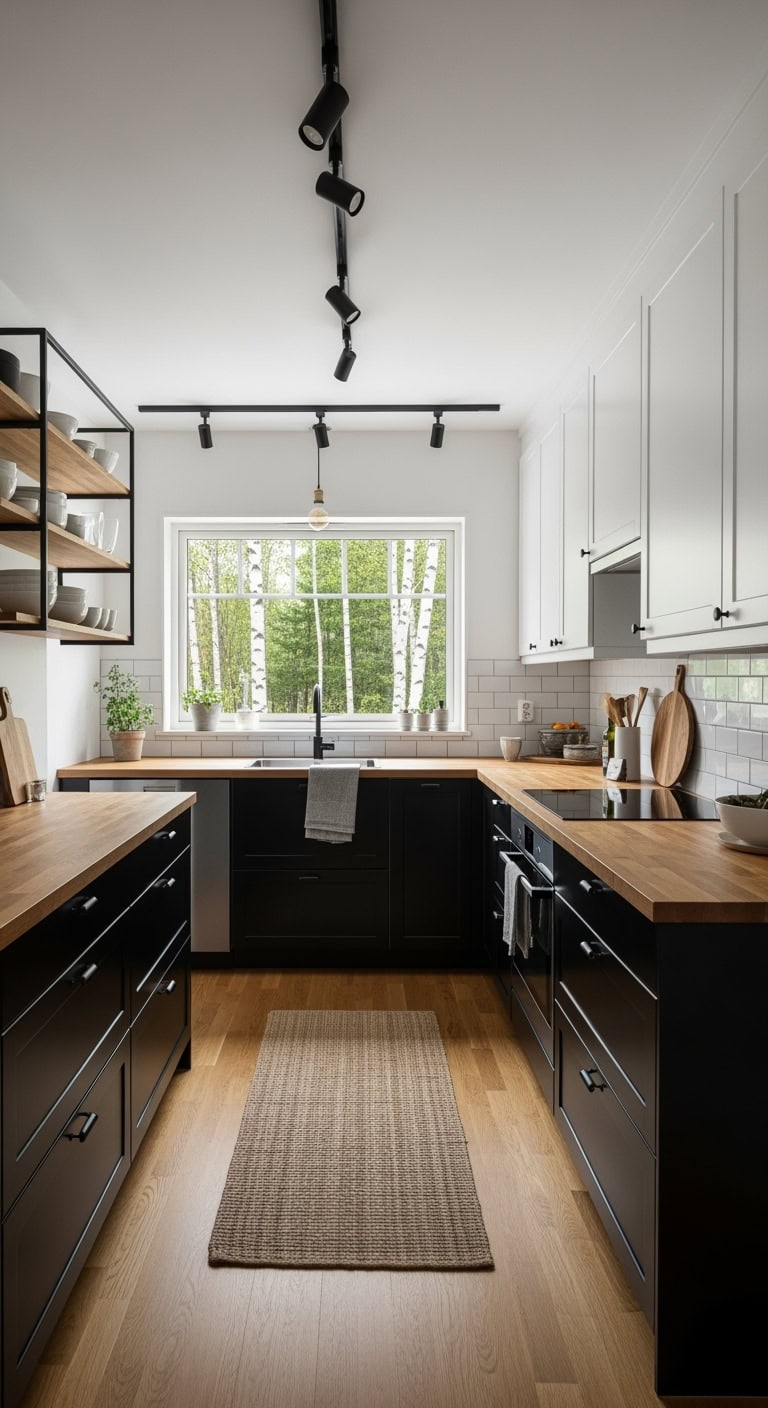
    That minimalist coffee shop aesthetic you keep screenshotting? Black shaker cabinets paired with warm wood countertops nail it every time. It’s like wearing all black with camel accessories—sophisticated without trying too hard, and somehow makes your space feel bigger while looking more expensive.


    DIY Paint Transformation

    • Cabinet refresh: Benjamin Moore “Black Beauty 2128-10” in satin finish for lower cabinets only, keeping uppers in “White Dove OC-17” for that floating effect
    • Wall magic: Sherwin Williams “Accessible Beige SW 7036” on all walls—it’s the perfect warm neutral that makes black cabinets feel cozy, not cave-like

    Budget Range: $18,000-$28,000 | Timeline: 4-5 weeks | Best For: Galley kitchens and narrow spaces.


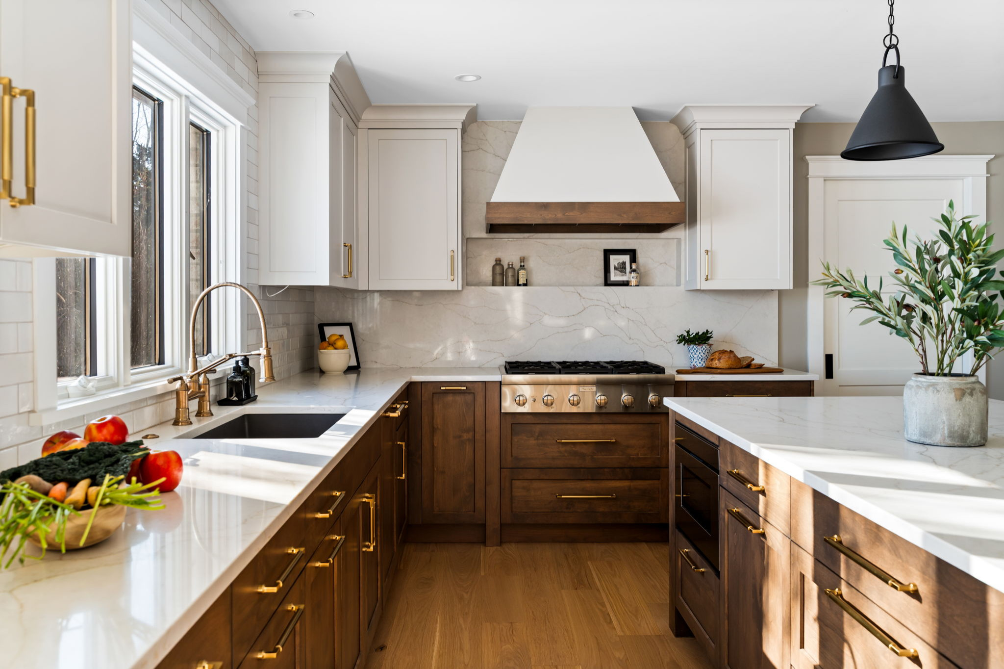
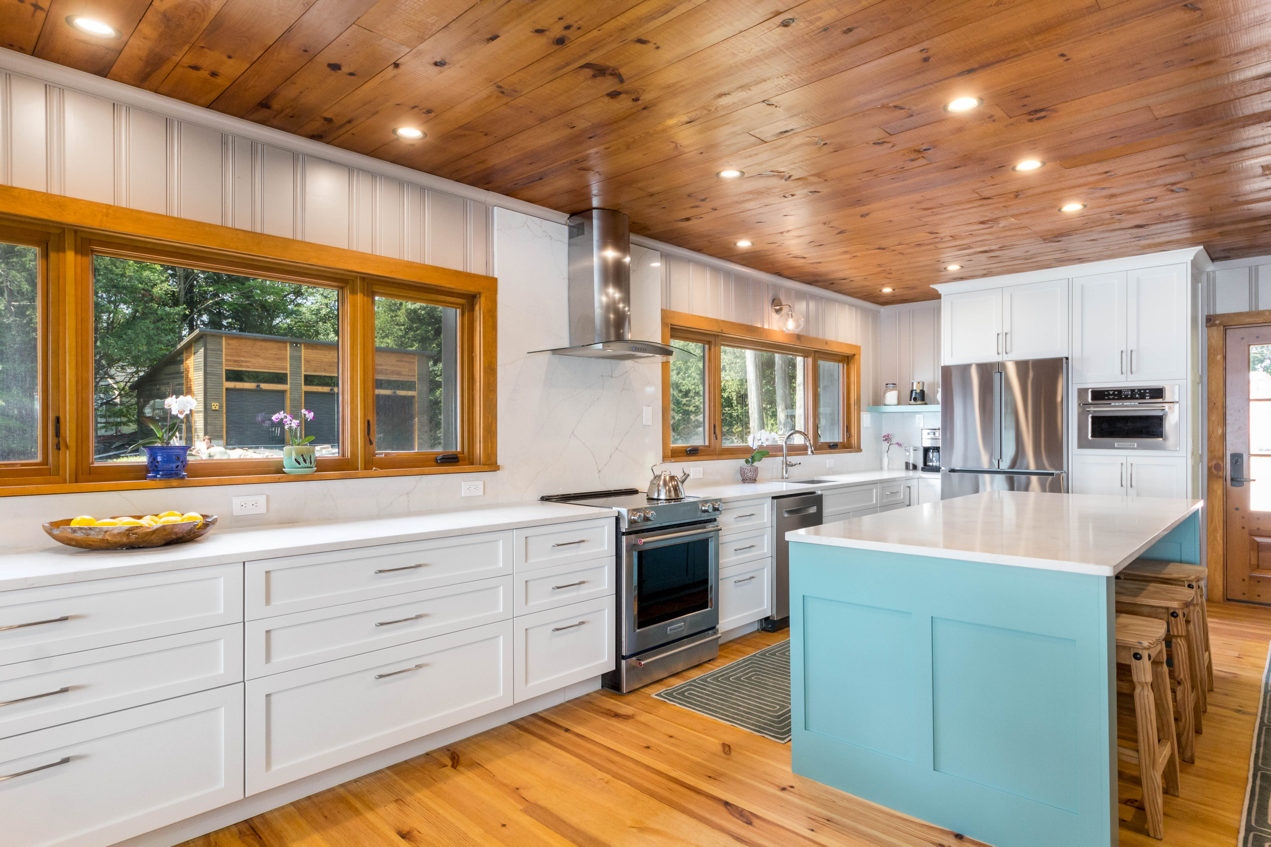
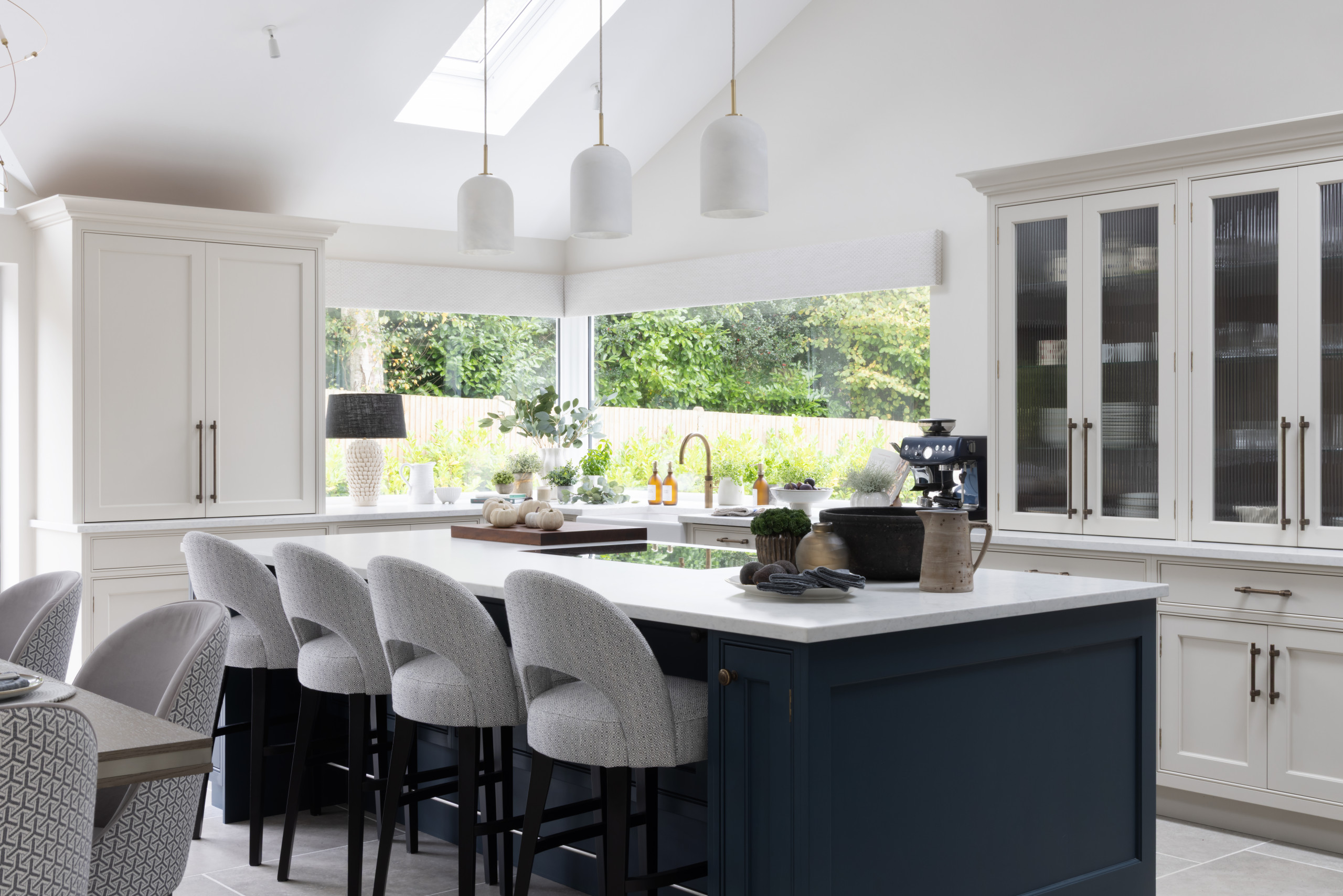
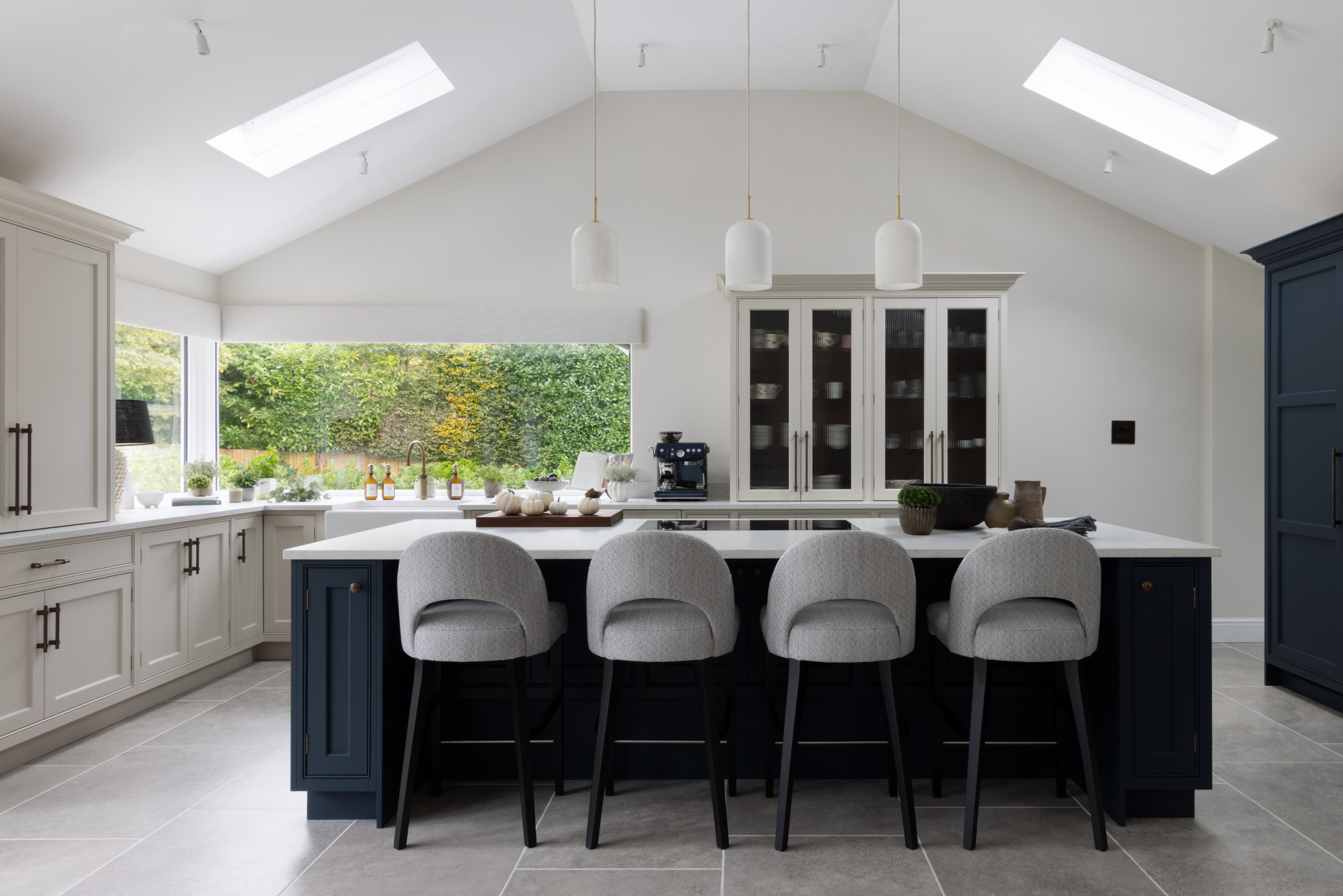
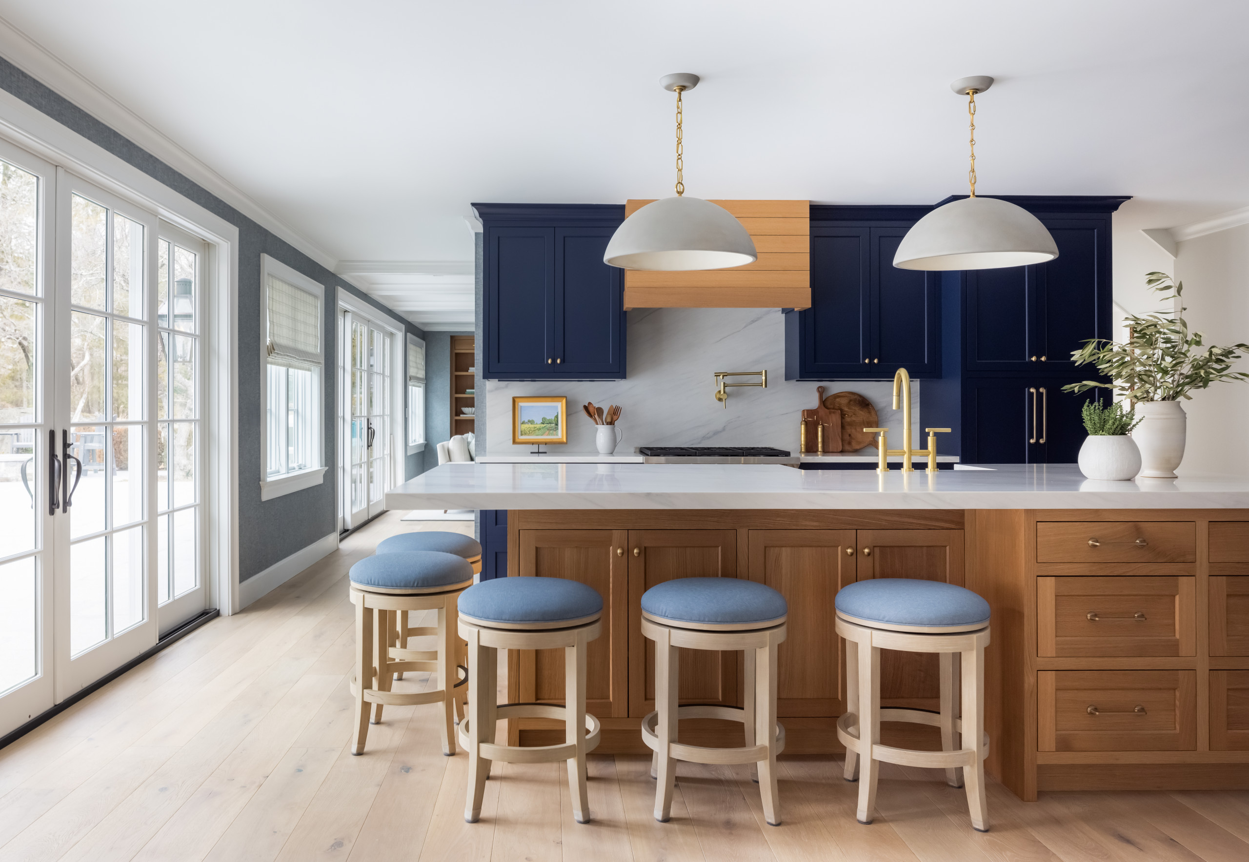
    6.Bold Monochrome: All-Black Kitchen With Matching Appliances and Backsplash

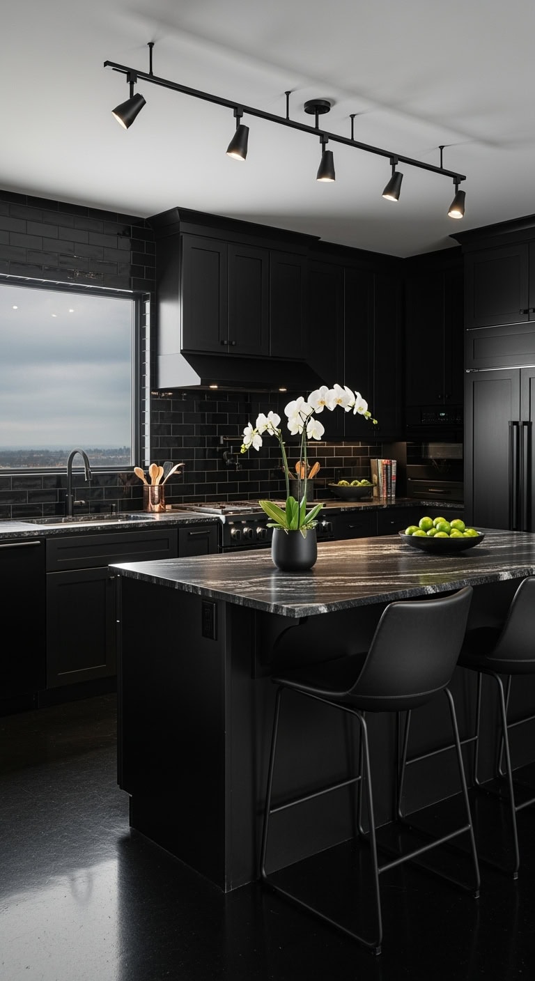
    All-black kitchens are like that perfect little black dress—dramatic without trying too hard, sophisticated but never boring. This monochrome moment transforms your cooking space into the kind of kitchen where everything from meal prep to midnight snacks feels like a scene from a moody interior design show. It’s giving luxury hotel meets your favorite dimly-lit wine bar.


    DIY Paint Transformation

    • Cabinet refresh: Benjamin Moore “Black Beauty 2128-10” in satin finish for existing cabinets—sand, prime with Kilz adhesion primer, then two coats for that premium matte-black finish
    • Wall drama: Sherwin Williams “Tricorn Black SW 6258” on all walls, or go bold with Farrow & Ball “Pitch Black No. 256” for that velvety, light-absorbing effect

    Budget Range: $18,000-$30,000 | Timeline: 4-5 weeks | Best For: Modern lofts and contemporary homes.


    7.Farmhouse Fusion: Black Cabinets With White Subway Tile and Wood Beams

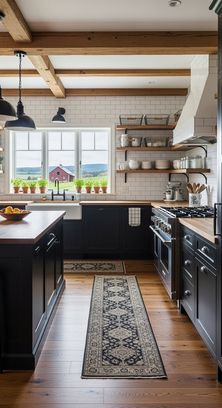
    That perfect farmhouse-meets-modern vibe you’ve been saving on your “Dream Kitchen” board? It’s basically the denim jacket of kitchen design—works with everything, never goes out of style. Black cabinets ground the space while white subway tiles and exposed beams keep it from feeling like a cave where you hide from your kids.


    DIY Paint Transformation

    • Cabinet refresh: Transform builder-grade cabinets with Benjamin Moore “Wrought Iron” (2124-10) or Sherwin Williams “Tricorn Black” (6258) in satin finish for that authentic not-too-shiny look
    • Perfect wall pairing: Benjamin Moore “White Dove” (OC-17) on walls with “Revere Pewter” (HC-172) on the island creates depth without the commitment of all-black everything

    Budget Range: $18,000-$28,000 | Timeline: 4-5 weeks | Best For: Open floor plans with natural light.


    8.Contemporary Glass Front: Black Frame Cabinets With Glass Panel Inserts

    Black frame cabinets with glass inserts are basically the little black dress of kitchen design—sophisticated yet shows off what you’ve got inside. Like those gorgeous coffee shop displays that make you want to reorganize your entire pantry, this style turns your everyday dishes into decor. It’s the perfect middle ground between open shelving (dust nightmare) and solid doors (where things go to disappear forever).


    DIY Paint Transformation

    • Existing cabinet refresh: Paint frames with Benjamin Moore “Black Beauty” (2128-10) in semi-gloss for that factory-finish look. Replace center panels with glass from your local hardware store.
    • Wall color pairing: Sherwin Williams “Pure White” (SW 7005) for walls to make black frames pop, or “Agreeable Gray” (SW 7029) for a softer contrast that won’t compete with your displayed items.

    Budget Range: $18,000-$28,000 | Timeline: 4-5 weeks | Best For: Galley kitchens and homes with curated dishware collections.


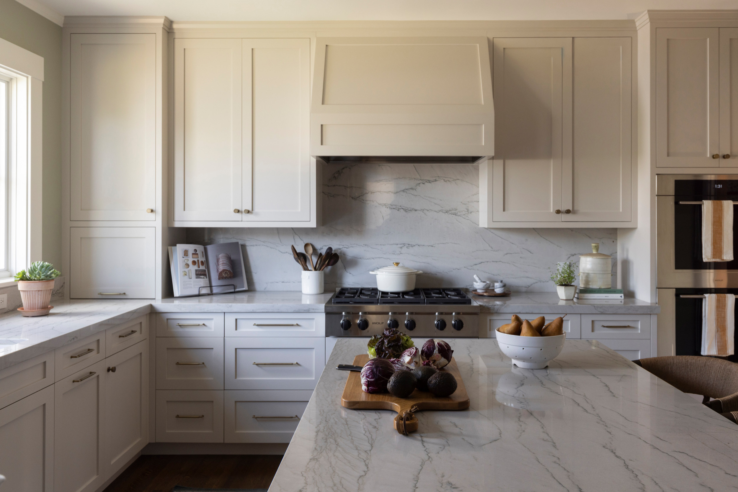
    9.Marble Elegance: Black Cabinets Paired With White Marble Countertops

    Like pairing your favorite little black dress with pearls, this combination never fails to impress. The contrast creates that expensive coffee shop aesthetic everyone’s trying to recreate at home. Your friends will assume you hired a designer when they see those stunning veining patterns against dramatic black surfaces.


    DIY Paint Transformation

    • Cabinet refresh: Transform existing cabinets with Benjamin Moore “Black Beauty” (2128-10) in satin finish for that perfect not-too-shiny look that hides fingerprints
    • Wall magic: Paint walls in Farrow & Ball “All White” (2005) with Benjamin Moore “Cloud Cover” (OC-25) on the ceiling to soften the contrast

    Budget Range: $18,000-$30,000 | Timeline: 4-6 weeks | Best For: Galley kitchens and traditional layouts.


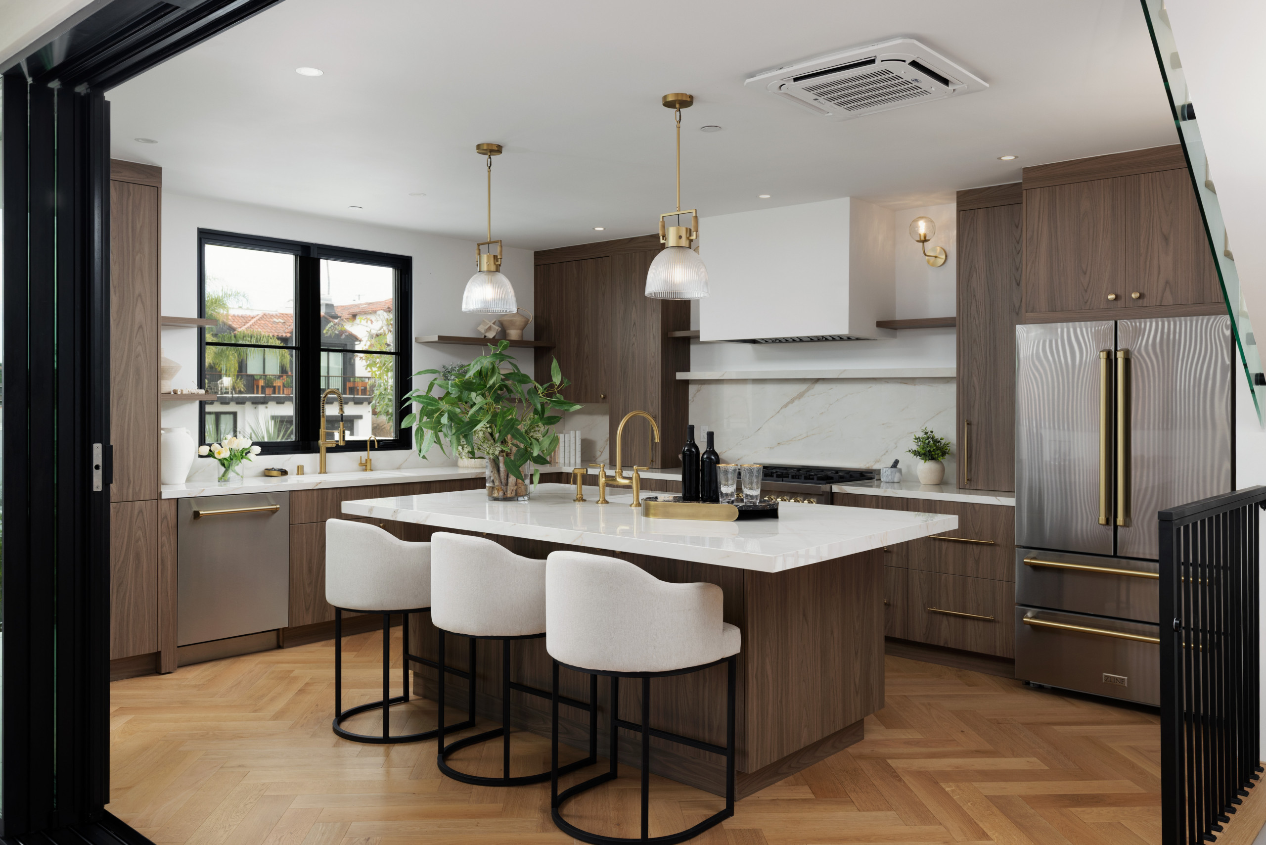
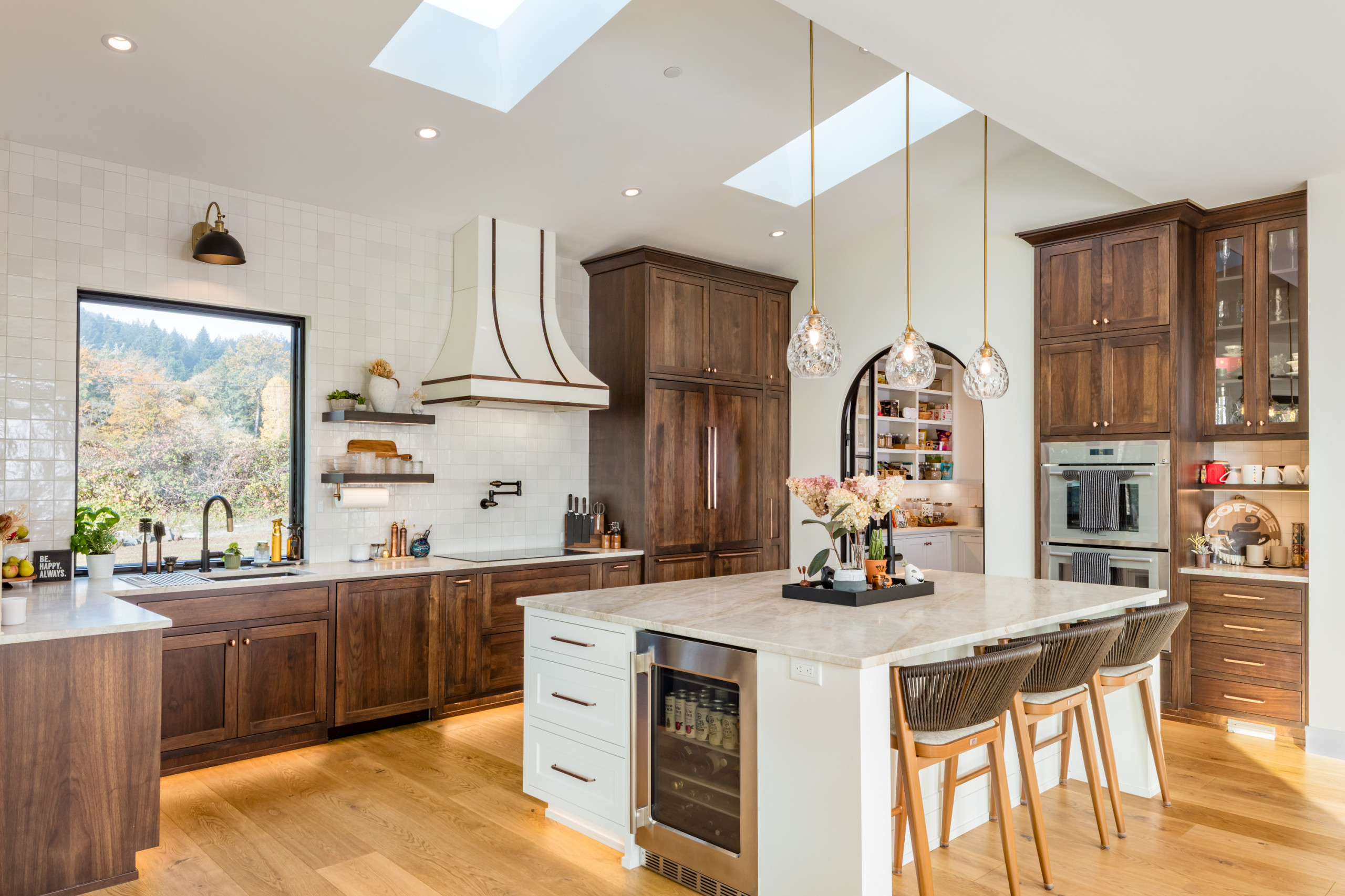
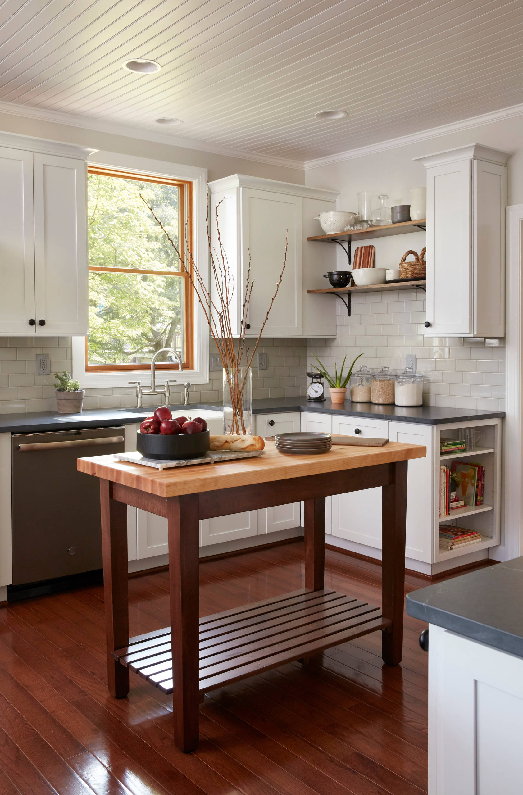
    10.Warm Wood Combination: Black Cabinets With Natural Wood Island

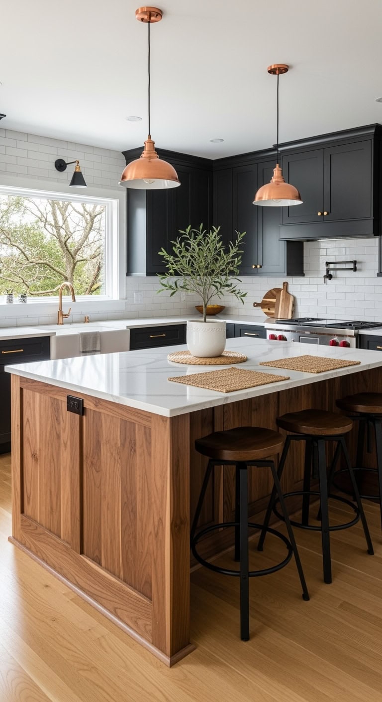
    That coffee shop aesthetic where industrial meets cozy? This combo nails it. Black cabinets ground the space while a natural wood island becomes your kitchen’s conversation piece—like wearing all black with camel accessories. It’s the look that makes hosting feel effortless and your Stories look professionally styled.


    DIY Paint Transformation

    • Cabinet refresh: Transform existing cabinets with Benjamin Moore “Black Beauty 2128-10” in satin finish for that perfect not-too-glossy depth. Sand thoroughly and use a bonding primer first.
    • Island makeover: Strip and stain your island base with Minwax “Provincial 211” for authentic wood grain that reads expensive. Seal with matte polyurethane for durability.

    Budget Range: $18,000-$28,000 | Timeline: 3-4 weeks | Best For: Open-concept spaces with natural light.


    11.Art Deco Revival: Black Cabinets With Geometric Tile Patterns

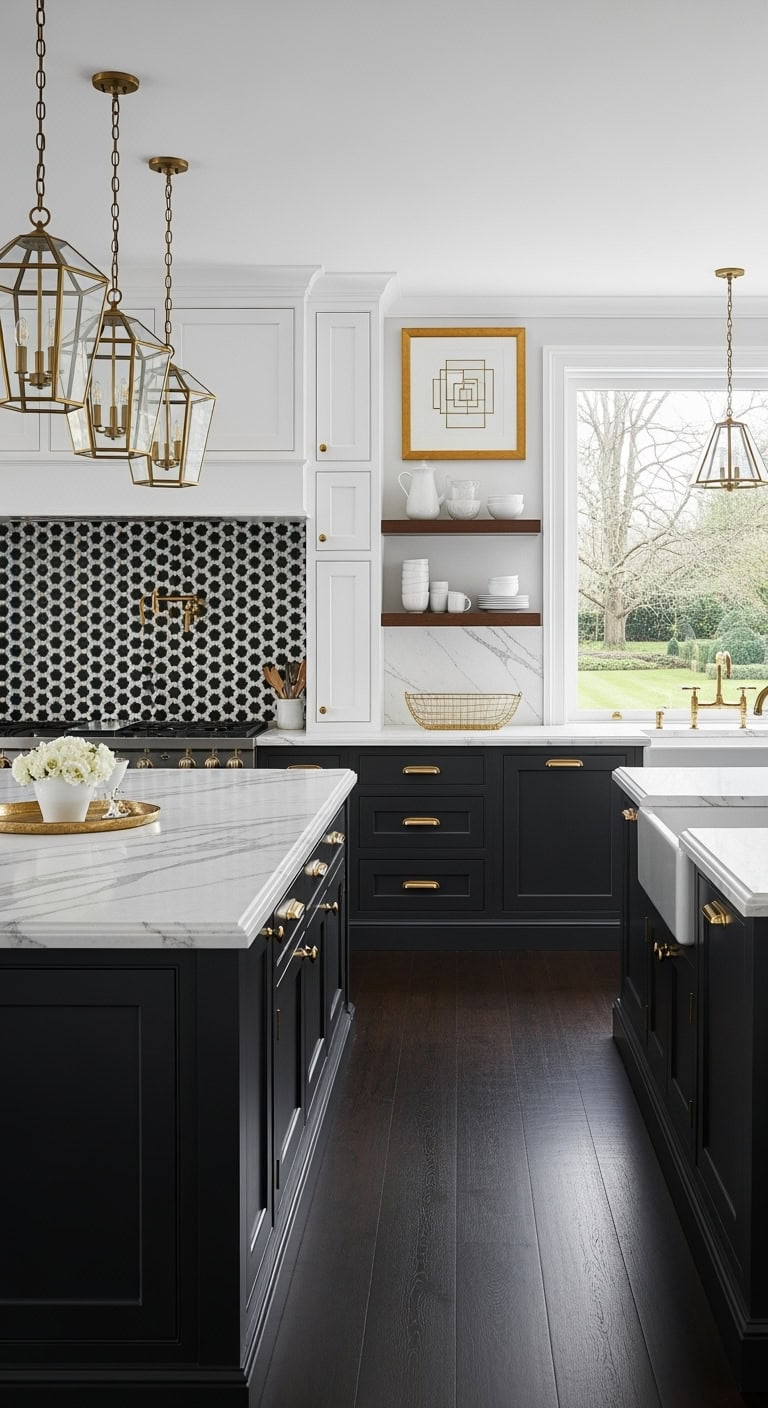
    The Great Gatsby meets your morning latte—that’s the vibe when geometric tiles meet black cabinets. This style transforms your kitchen into that boutique hotel bathroom you screenshot on vacation, but actually livable. It’s structured enough to hide the chaos of weeknight dinners yet sophisticated enough for your book club’s wine nights.


    DIY Paint Transformation

    • Cabinet refresh: Benjamin Moore “Black Beauty 2128-10” in satin finish for lower cabinets, keeping uppers in “Simply White OC-117” to prevent cave vibes
    • Wall magic: Sherwin Williams “Tricorn Black SW 6258” for one accent wall behind open shelving, with remaining walls in “Alabaster SW 7008” for breathing room

    Budget Range: $18,000-$28,000 | Timeline: 4-5 weeks |

    Best For: Galley kitchens and defined kitchen spaces.

  • 10 Common Kitchen Layout Mistakes and How to Avoid Them

    Choosing beautiful finishes and fixtures for your new kitchen is one thing, but if you get the layout wrong, it won’t function as well as you want it to. Design experts reveal the 10 most common layout errors that kitchen renovators make and what to do to avoid them.


    1. Inadequate Circulation Space

    Failing to allow enough circulation space can make a kitchen feel cramped and restrict the number of people who can comfortably use the space at the same time, says Jenefer Gordon, principal at interior design firm Eat Bathe Live. “It causes even more issues when your kitchen doubles as a thoroughfare. A lack of space can also make it difficult to open appliances such as the fridge and dishwasher,” she says.

    Solution:
     To provide adequate circulation, try to have about 4 feet of space between kitchen countertops, Gordon says. Allow a little more room if there is a thoroughfare leading through the kitchen. “In a small kitchen, [39 inches] would be the minimum amount of space between countertops, but aim for more if you can,” she says.


    2. Not Planning Around the Workflow

    “A good kitchen workflow is essential. If you don’t have one, your kitchen will be inefficient, and you can end up running backwards and forwards between the different parts of your kitchen every time you cook, wash or prep,” Gordon says.

    Solution: In the planning stages, carefully consider how you use your kitchen, she says. She suggests increasing functionality by including storage for spices and oils near the cooking zone and storing cutlery and dishes near the dishwasher. “You’ll find many smart solutions on the market, including wide drawers and tailored inserts that facilitate high-functioning storage,” Gordon says.


    3. Not Measuring Appliances

    Lack of planning when it comes to appliances can lead to excessive protrusion from oversize refrigerators. “This can affect the ability to open cabinets and other appliances in your kitchen, and reduce circulation space,” Gordon says.

    Not measuring small appliances like microwaves, blenders and food processors can be an issue too. Without a proper home, they can end up sitting out on the counter and creating clutter, she says.

    Solution: Select appliances well in advance, checking the dimensions and the way appliances open to ensure that your kitchen layout can accommodate them in concealed, tailored storage, Gordon says. This also applies to pots and pans.


    4. Poor Lighting Placement

    If you don’t put the right light fixtures over your countertops, you will end up prepping, cooking and cleaning up in the shadows, says designer Naomi Findlay.
    “Another common lighting mistake is prioritizing aesthetics over functionality. Pretty pendants are beautiful, but if they don’t shine enough light over your work surfaces, they will not be practical,” she says.

    Solution: Findlay recommends positioning lighting slightly in front of you rather than directly overhead or behind you. Installing downlights, pendant lights and sconces on separate circuits makes it easier to control your lighting levels and atmosphere, she says. And don’t forget to choose bulbs that emit sufficient light, so you can see what you’re doing when you’re chopping and cooking.


    5. Forgetting About Function

    When planning your remodel, make sure you put your kitchen’s busiest areas — the sink, stove and fridge — in practical locations that are relevant to one another while allowing enough space for people to use and access them comfortably, Findlay says.

    When choosing cabinetry, make sure the doors won’t block your workflow when they’re open, she says. “The last thing you want is your fridge and cupboard doors banging into each other every time you open them!”

    Solution: Plan your kitchen layout as far in advance as possible, and choose your appliances before you start looking at cabinetry, Findlay says. “This will allow you to fit your units around your appliances, rather than the other way around, giving you a seamless look that’s both smart and space-efficient.”

    Tip: Think about how many people live in your home and will be using the kitchen at one time, she says. If it’s going to get crowded, you may have crammed too many elements into the kitchen layout and may want to consider scaling back.


    6. Wasted Space on a Kitchen Island

    Kitchen islands are great for increasing your prep and storage space but will work only if you have the room, Findlay says. If your kitchen is small, an island can be a waste of space.

    “Placing an island in the wrong spot is another recipe for disaster,” she says. “A poorly positioned island can obstruct the flow of traffic to and from the sink, refrigerator, stove and primary workstations, creating a bottleneck in your kitchen.”

    Solution: Choose an island only if your kitchen can accommodate it or specify a narrow one. Findlay suggests having about 40 inches on both sides of the island for good traffic flow. “Deciding how big or small your island unit should be will depend on what it needs to house and the proportions of your kitchen,” she says. “I would recommend a minimum width of [about 47 inches] for a kitchen island. But if you don’t plan on installing a sink or a stovetop in it, you could go as narrow as [about 24 inches] in width.”


    7. Inadequate Space Between the Sink and the Stove

    The area between the sink and the stove is the main food preparation area, so although there are no set guidelines, you’ll want a decent expanse of countertop space there, says Cherie Barber, owner of Renovating for Profit, which offers online instruction in remodeling.

    Solution: When planning your kitchen, make sure the layout meets the practical day-to-day needs of the kitchen user, she says.


    8. Poorly Positioned Cabinet Doors and Drawers

    Cabinet doors and drawers can end up blocking doorways and walkways when they’re opened, Barber warns.

    Solution: “Planning is key,” she says. “Before you commit to a layout, think about how and where all the elements in your kitchen will open, including cupboards, drawers, the fridge and dishwasher, and how people will move through the space.”


    9. Not Maximizing Vertical Wall Space

    In a small kitchen, every bit of space counts, and your walls offer valuable storage real estate, Barber says.

    Solution: “Taking your cupboards right up to the ceiling will maximize your storage potential in a compact kitchen,” she says. “If you don’t like the idea of rows of closed-door cupboards, you can always mix it up with open shelving.”

    Tip: If your wall cabinets are positioned over a cooktop, minimum clearance rules apply, Barber says. The minimum requirements can vary for electric and gas cooktops, and range from 2 to 3 feet, she says.


    10. Assuming You Need a New Layout

    “I’d never automatically dismiss the existing layout of a kitchen,” Barber says. “It’s often planned that way for very practical reasons, such as placement of doors and windows and the most logical traffic flow.”

    Solution: A tweak to the layout, such as making it open plan or adding a breakfast bar or an island, may be all that’s needed, she says. This can save money because you won’t have to move electrical and plumbing systems.

    “If you’re designing a kitchen layout from scratch, address the practical considerations first: How many people will be using the kitchen on a regular basis? Do you do a lot of entertaining?” she says. “This will help you work out the kitchen’s size and function.”

    Then consider how the work triangle — cooktop, sink and fridge — will best fit your layout, she says. Allow enough space between the three points of the triangle, so you’re not walking yards between them every time you use your kitchen.

  • Kitchen With Clever Storage in a 16th-Century Space

    The low, beamed ceiling in this room in a centuries-old English house presented a challenge for kitchen specialist Chisholm Design. The firm had been tasked with creating a kitchen here where there once was none. In doing so, they needed to incorporate plentiful storage without the space feeling cramped. This was especially important because the front of the home dates from the 18th or early 19th century, with high ceilings and big windows, and the back of the house, where the kitchen is located, is 16th century, with low ceilings.

    “There’s quite a mismatch in the feel of the house as you go through it, so it was important the spaces flowed together,” designer Joanna Chisholm says. She did this by keeping the kitchen light and open, so the low ceiling and reduced light is less apparent, and by building storage neatly into all the available space, including under the stairs and within the fireplace.

    Before: “The clients had recently bought the house and it was a complete mess — it didn’t have a kitchen in it when we first got there,” Chisholm says. “They had quite a lot of work to do to the building — part of the outside wall was collapsing.”

    They needed to level the floor, replace the windows, repoint some of the internal brickwork and replace the post in the middle of the room. “It wasn’t fit to hold up the house,” she says.

    After: The designers made sure they kept some of the original “wonkiness” of the room. “The clients were really keen that we retain as much of that as possible because they wanted it to feel like an old house,” Chisholm says.

    The team fitted a sturdy new oak pillar to replace the weak post and incorporated it into the end of the island to ensure they could still give the couple a good-sized breakfast bar.

    In addition to wanting to make the most of every inch in the kitchen, the homeowners requested a large island. “They do a lot of socializing so they wanted to be able to gather around the island and, because the dining table isn’t in the kitchen, they also needed to be able to sit there comfortably for meals,” Chisholm says.

    They also asked for a big sink so they could easily soak baking sheets and large pans, and plenty of food and dish storage as they were aware there wasn’t much room for wall cabinets.

    Keeping the space as light as possible was important. “It’s south-facing, but on a dull day there isn’t a huge amount of light coming in,” she says. Along with painting the walls and ceiling white, she’s chosen pale limestone for the flooring and a pale but — crucially — warm neutral for the perimeter cabinets.

    The island has been given definition with a gray-green paint. “The clients wanted the kitchen to feel calm and connected to the garden, which is why they opted for the green,” Chisholm says.

    Chisholm has left gaps between the new oak pillar and the quartz upstand that wraps around it because of the nature of the wood. “The oak is going to move over time, so we couldn’t put a bead of silicone around it as we usually would,” she says.

    To help compensate for the lack of wall units in the rest of the kitchen, Chisholm designed this bank of tall cabinets containing masses of storage.

    In the middle is a breakfast bar with drawers below. The bifold doors can be left open without getting in the way so the room can benefit from the interior lights.

    The tall cabinet on the left contains shelving for additional items such as serving dishes, while the cabinet on the right is a pantry with spice racks on the doors, roomy shelves and open drawers at the bottom.

    Before: The old staircase, to the right of where the tall cabinets are now, wasn’t functional. The floor needed to be lowered and the ceiling beams replaced on this side of the room.

    After: The staircase has been replaced. The cupboard at the back of the stairs is a larder refrigerator, which doesn’t contain an ice box. The freezer is in the laundry room, just seen inside the open door.

    It was a tight fit to get the tall appliance into the sloping space. “The builders often don’t put stairs in until quite late so we had to wait until they were properly in, then measure the angle and depth [of the space] to make sure we could physically get the [refrigerator] in before ordering it,” Chisholm says.

    The thickness of the floor tiles had to be taken into account too. “We’re mindful of buildup,” Chisholm says. “If a builder puts [an inch] on the wall or floor, for example, it can make a massive difference.”

    The brass ventilation grille above the door is a smart detail that works nicely with the beams.

    The oak wine rack was also a challenge. “We had to make sure the fridge didn’t heat up the bottles, so there’s some extra insulation in there,” Chisholm says.

    There are no radiators in here so the team laid underfloor heating beneath the limestone tile.

    Three black-and-brass pendant lights hang over the island. The electrical conduit running along the beam is actually white plastic, which was massively cheaper than a brass version. “The homeowner did a very clever job of getting it to look like brass by spray-painting it,” Chisholm says.

    In addition to the island pendants, there are discreet white flush spotlights dotted between some of the beams, as well as lighting within and below the glass wall cabinet, above the range and in all the tall cabinets.

    The double doors seen here lead into the dining room, which is more of a formal dining space.

    The island is large — 8 feet by 3⅓ feet — but Chisholm has softened it with curves. “I do think they make a difference,” she says. “[The clients] didn’t want lots of curves, but the one on the end of the sink run, for instance, is nice, because that’s a walkway into a study so it softens it. I think if it had been square, it might have been a bit harsh.”

    The open end of the tall unit is also curved, but Chisholm hasn’t gone overboard. “We don’t have them on the sides of the wall cupboard, for example, as you can over-curve things if you’re not careful,” she says.

    “The cabinets are our country Shaker design,” she says. “There’s a little bit of beading inside the frames just to give that more traditional look, which goes with the house.”

    Most of the day-to-day dishware, pans and flatware live in the island, while a wooden tray and two cutting boards have their own slots in the side. “They add a bit of warmth and tie in with beams,” Chisholm says.

    Chisholm has built in one upper cabinet, making the most of this little space. The unit is tucked right up against the beam, with the trim cut to fit.

    The cupboard doors are glass, so the room can benefit from the interior lighting “and it doesn’t feel as heavy as a solid door,” Chisholm says. “The glass is fluted so you can hide things a little that aren’t necessarily beautiful but still get the light.”

    The part-glass back door brings in extra light. The barn door style means the owners can open just the top half to prevent the dog from escaping.

    The 1½ bowl farmhouse sink by Thomas Denby is an unusual configuration, having a big 20-inch-wide bowl on one side, and a little 8-inch bowl on the other. “It’s the best of both worlds,” Chisholm says. “A double [farmhouse] sink tends to have two smallish bowls. The client was keen to have one where she could properly soak things.”

    The sink is flanked by a dishwasher and a cabinet for trash bins.

    The clients wanted a freestanding range cooker, which has multiple ovens, a grill and burners. “It fits with the house and also there wasn’t a lot of room to have ovens in a tall tower,” Chisholm says.

    She managed to make use of the original fireplace, but “it was very wonky. It was tricky to get an extractor [range hood] in without a lot of digging around in the ceiling, but the builder did a brilliant job of getting the ducting up, across the ceiling and out,” she says.

    The wood lintel and brickwork are original. “The clients were really keen on it not all being made straight and keeping its character,” Chisholm says. The antique mirror backsplash reflects the light and goes with the feel of the room.

    The cupboards on either side of the range are quite shallow as it’s such a deep fireplace, but they’re perfect for oils, herbs and spices. “They work really well there, otherwise the larder is quite far away at the other side of the kitchen,” Chisholm says.

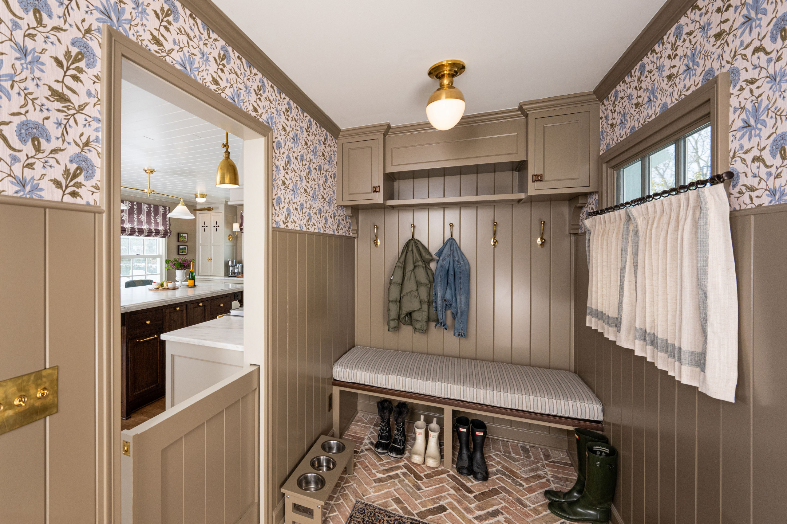
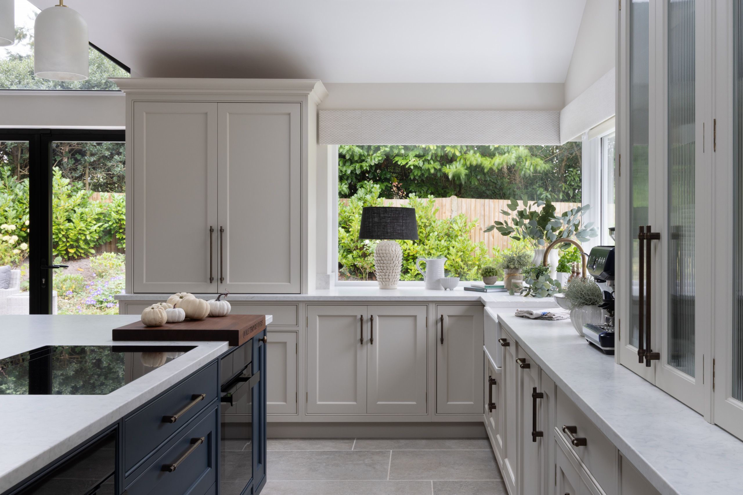
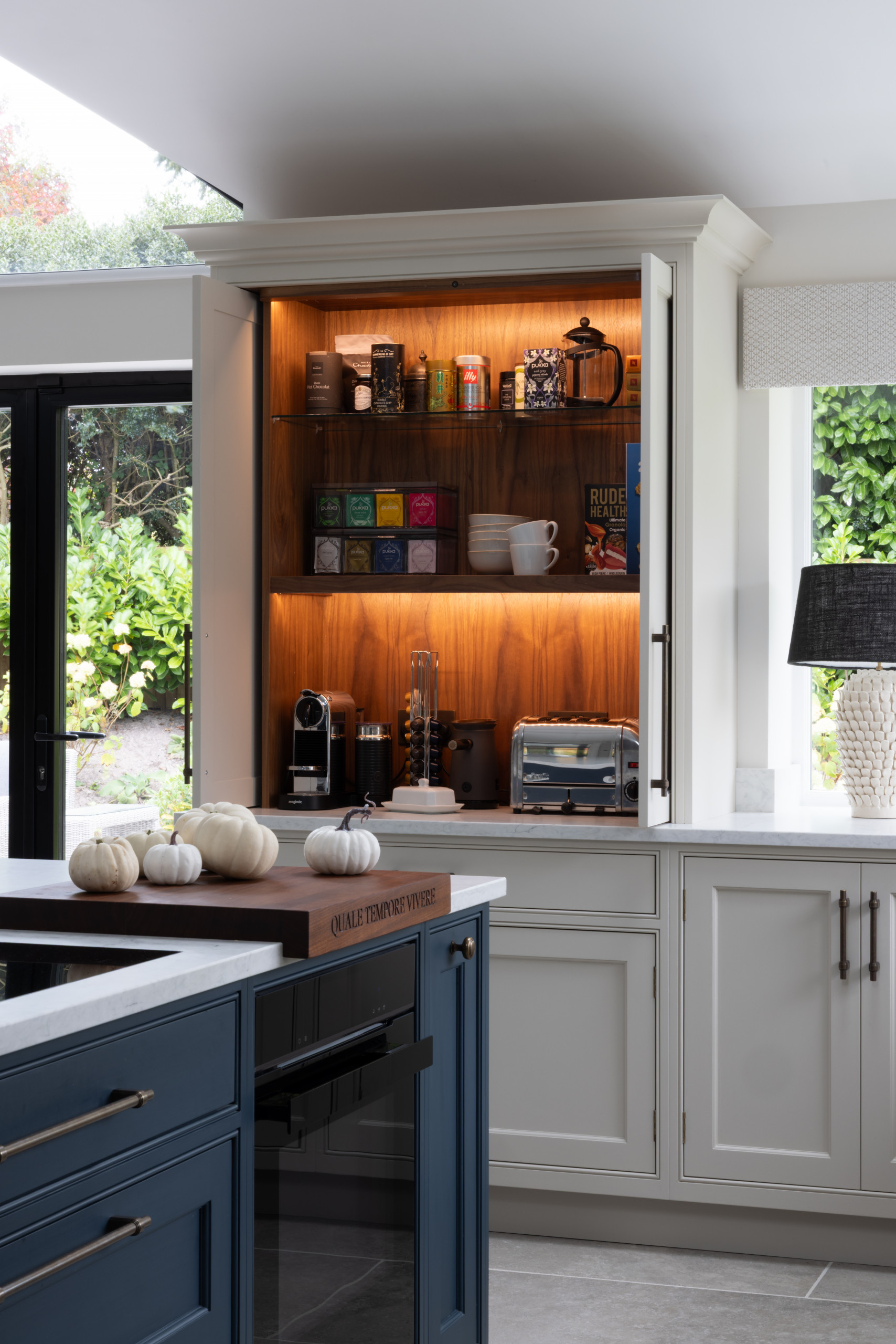
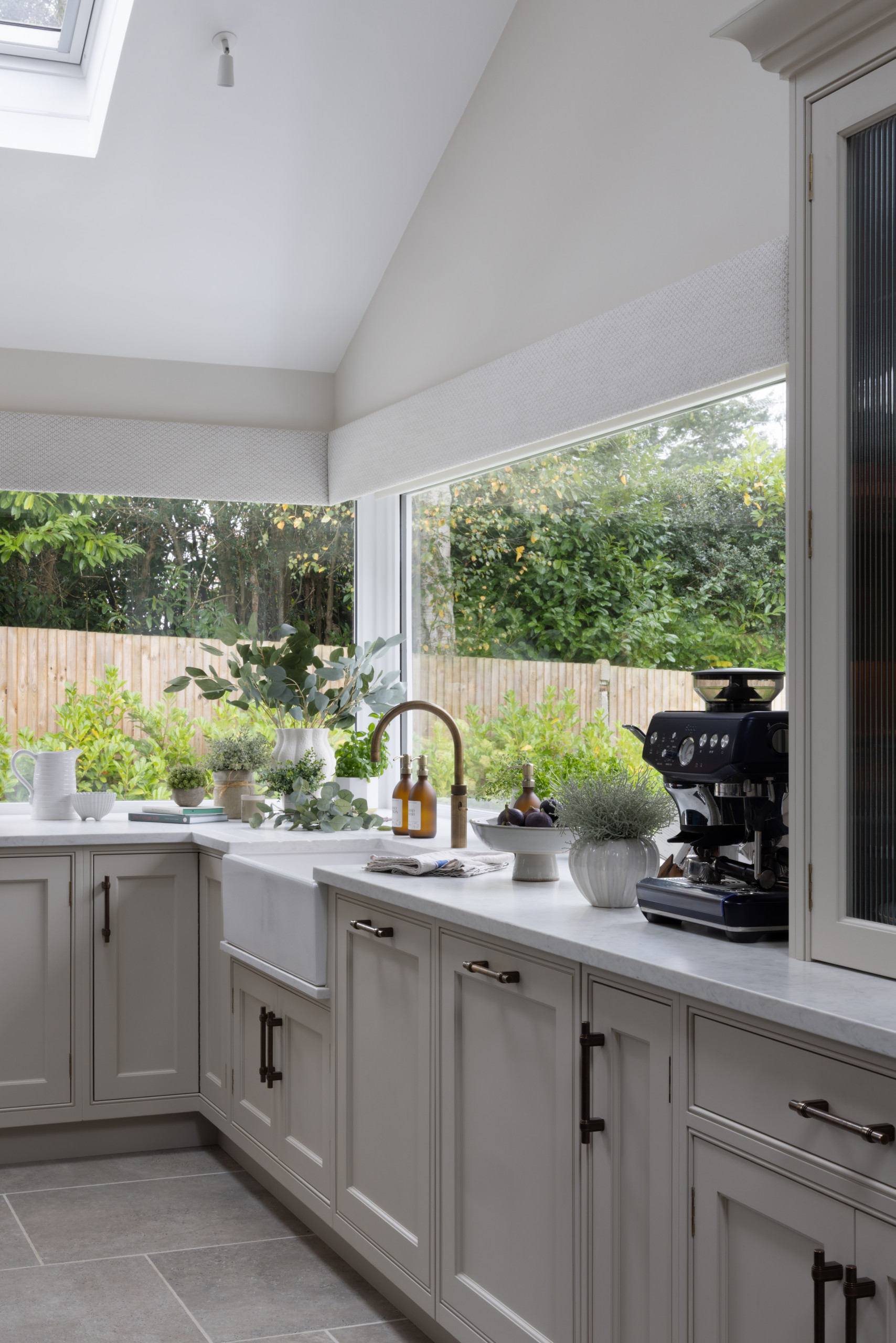
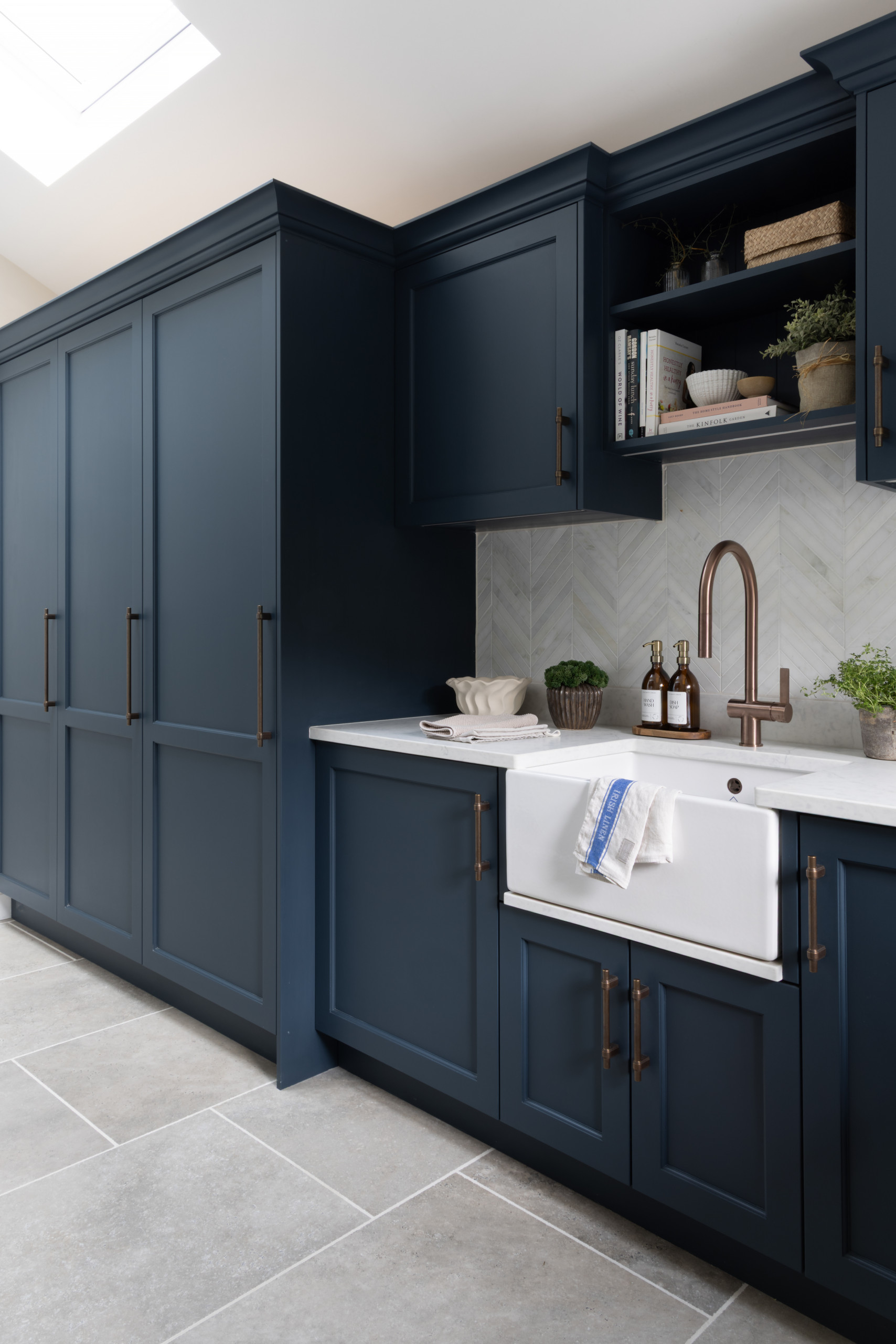
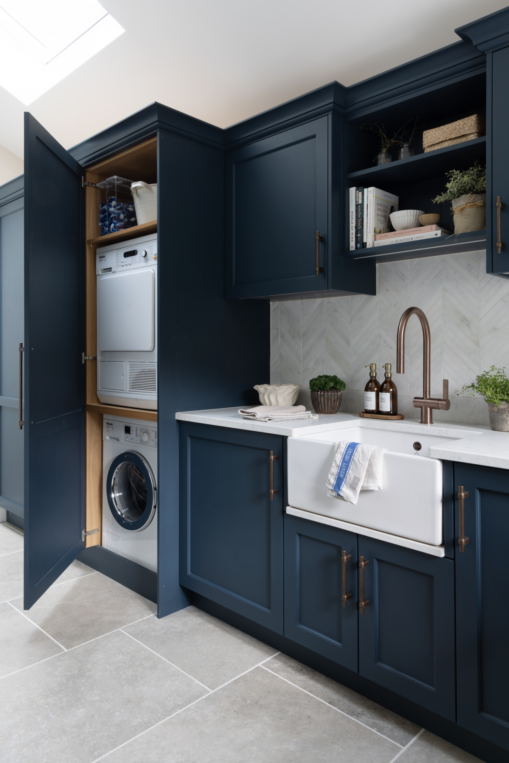
    Chisholm has also made brilliant use of the space in the adjacent laundry-mudroom.

    On the mudroom side, ceiling-high cabinets, painted in the same color as the kitchen cabinets, hide a large Megaflo hot water cylinder, the boiler and a water softener. “There was a lot of plumbing to be thought about,” Chisholm says. Laundry rooms “can be tricky because of all the plumbing, and you can’t really measure until all that plumbing is in.”

    To the left are coat hooks and a bench with a drawer underneath for hats and gloves, as well as a cupboard for rain boots with baskets above.

    On the laundry side, there’s a tall freezer within easy reach of the kitchen, then a stacked washing machine and dryer, and storage for cleaning and laundry essentials. Chisholm also included a dog shower for after muddy walks.
  • Before and After: 4 Inspiring Kitchens in 320 to 350 Square Feet

    A kitchen that measures 320 to 350 square feet offers tons of roomy potential. The abundant space allows for an open layout, optimized cooking zones and enhanced entertaining, all with plenty of elbow room. Here, before-and-after photos of four uplifting kitchen remodels show a little of what’s possible.


    1. Charming and Cheerful

    Before: This aging Delafield, Wisconsin, kitchen had dark cabinetry and countertops that gave it a heavy, shadowy look. An off-center stainless steel range, backsplash and hood dominated a back wall. The refrigerator stood on a wall to the right of the range, out of view, across from the sink and separated from it by the island, creating an inefficient workflow. The only pantry was located down the hall, accessed through a mudroom.

    The homeowners, a couple with grown children and two dogs, wanted a kitchen with improved storage, a more efficient layout and a fresh look with an antique English sensibility. For help, they hired design-build firm Refined Renovations.

    After: After removing and donating what they could from the old kitchen, the Refined Renovations design and production teams had a blank canvas. Drawing inspiration from historical English kitchens and sculleries, this cheerful and charming makeover spearheaded by lead designer Morgan Taugher includes painted custom inset perimeter cabinets surrounding a stained oak island, all topped with marble-like Matarazzo quartzite.

    Slightly shifting the location of the sink, placing the new paneled refrigerator to its left, centering a smaller range on the back wall and rotating the island 90 degrees created a more user-friendly layout. The furniture-look island, new decorative ceiling beams and refinished and stained hardwood floor add warmth. A bank of tall windows measuring just over 6 feet wide lets in abundant sunshine.

    2. Light and Lofty

    Before: This Las Vegas kitchen had a dark and dated 1990s Mediterranean style the homeowners disliked. A soffit wrapping the room forced the upper cabinets down, creating a closed-in feel. Tile flooring was cold and hard on the feet. And the small office niche in the back corner sat mostly unused.

    But the couple, parents of four kids, had a keen fondness for the impressive arched opening between the kitchen and breakfast room. Wanting a brighter space with high-end appliances and a more custom look, the couple turned to designer Rebecca Zajac.


    After: Using the arched opening as inspiration, Zajac designed a modern Spanish-style kitchen. She repeated the arch motif with an arched opening to a new butler’s pantry, an arched custom range hood and arch details on a new black-stained oak island.

    The removal of the soffit allowed Zajac to take a couple of banks of upper cabinets flanking the range all the way to the raised ceiling. The creamy white Shaker-style perimeter cabinets, soft white walls and marble-look porcelain countertops all deliver a light and airy look. A new engineered white oak floor adds warmth. Brass stools at the island coordinate with unlacquered brass cabinet knobs and pulls. Pendant lights over the island feature white plaster shades and a natural rusted iron finish.

    3. Modern and Warm

    Before: The forest setting of this Woodland, Minnesota, home was a big influence on the design. Lots of large windows brought the woodsy feeling indoors. But a large vent hood over the island was a head banger and blocked all the sightlines across the kitchen. The kitchen also felt enclosed and cut off from adjacent rooms.

    Most of the finishes in the kitchen dated back to 1978, so they showed the wear and tear of almost half a century of use. The homeowners wanted a more livable and attractive space, and turned to interior designer Colleen Slack for help.

    After: The designer used Houzz photos to communicate ideas to her clients and help find the exact style they wanted. Creating a space that would be warm modern but not specifically midcentury modern with details that were refined but not elegant were big goals.

    With the large vent hood gone, views across the kitchen are clear and the space is brighter and airier. Walnut cabinetry, a granite waterfall island bar, high-end appliances, a cozy banquette and a more open feel between rooms are just a few of the fully remodeled kitchen’s new assets. Meticulously book-matched cabinetry provides continuous horizontal graining patterns. Backsplash tiles with finished edges and large-format floor tiles that were painstakingly laid out in drawings on-site are other details that bring this livable space to the next level.

    4. Elegant and Functional

    Before: In this aging 1970s Davis, California, space, a peninsula divided the kitchen from the dining area to the left. White tile countertops, dated and aged parquet wood flooring, basic wood cabinets and the lack of a backsplash and sufficient storage did little to energize the look and feel.

    A former pantry can be seen at the back left. The brown door at the rear of the short hallway connects to the garage. The brown door on the right side of the short hallway leads to a closet, which the homeowners thought could be put to better use. Wanting to create an inviting and stylish kitchen where their family and friends could gather while they prepared meals, these empty-nest homeowners returned to designer Kellie Love, who had helped them renovate their laundry room and hall bathroom.

    After: Love eliminated the peninsula to open up the space. An island with seating anchors the new layout. A beloved piece of ceramic dishware from the homeowners’ collection inspired the warm and elegant color palette. Matte sage green perimeter cabinets (Herbes de Provence by Benjamin Moore) improve storage and offer a warm complement to the rift-cut white oak base of the island.

    Love transformed the pantry into a hutch-style built-in with glass-front upper cabinets that display the couple’s dishes. LED lights inside and underneath the cabinets help illuminate the area and create a warm glow at night. A new door to the garage has a touch keypad lock and lever handle in polished chrome. A new pocket door to the left of the fridge connects to a new walk-in pantry that replaced the former utility closet. The updated backsplash has 2½-by-10-inch matte white ceramic tiles in a horizontally stacked pattern. The warm, elegant style ensures the design will look stylish for years to come.

  • Before and After: 4 Versatile Kitchens in 310 to 370 Square Feet

    Kitchens that measure between 310 and 370 square feet offer room to stretch out — and to get creative. These medium-to-large spaces often come with enough square footage for better flow, generous storage and flexible island seating options, making them ideal for both everyday living and entertaining. To see what’s possible, check out how these design and remodeling pros transformed outdated or inefficient kitchens into stylish, functional hubs full of clever ideas and thoughtful details.

    1. Organic Modern Refresh With Streamlined Style

    Before: This Calabasas, California, couple appreciated the overall layout of their 2002 Spanish-style kitchen, as well as the rich stone tile flooring, decorative wood ceiling beams and pro-style appliances. But the ornate cabinet details, busy backsplash and green granite countertops didn’t match their style.

    Looking to create a more timeless feel with clean lines and an organic modern aesthetic, they brought in designer Sarah West to help elevate and streamline the space.

    After: While the original footprint stayed the same, West replaced the ornate cabinets, backsplash, countertops and island, thoughtfully integrating the elements the homeowners wanted to keep.

    Custom rift-cut white oak cabinetry combines Shaker-style doors and slab-front drawers, accented with a mix of oil-rubbed bronze knobs and pulls. A warm greige paint (Classic Gray by Benjamin Moore) covers the upper cabinets on the right, while creamy white walls (Swiss Coffee by Benjamin Moore) and a zellige tile backsplash tie the palette together.

    West removed the decorative wood trim on the hood, then reframed part of the hood and reshaped the corners for a cleaner look. A new plaster finish gives it a soft, refined feel, while a brushed bronze pot filler and shelf below add a touch of character.

    Backless leather-and-wood counter stools offer casual seating on three sides of the new island, which features post and foot details that give it a freestanding furniture look. Warm gray quartz countertops with soft charcoal veining complement the kitchen’s neutral palette. Three modern conical pendant lights with glass shades and oil-rubbed bronze finishes add a sophisticated touch.

    West also removed millwork that had previously blocked the arched sink window, opening up the view and emphasizing the curve, an elegant nod to organic modern style.


    2. Family-Friendly Expansion With Clever Storage

    Before: This Minneapolis couple and their three kids loved cooking and baking together. But the cramped U-shaped kitchen in their 1904 home didn’t support their lifestyle. A range wall on the right closed the kitchen off from a mudroom and an underused space, while worn white cabinets, dated finishes and aging appliances added to the frustration. The only element they wanted to keep was the red oak flooring, which just needed patching.

    To create a more open, functional kitchen with better storage, improved flow and a style tailored to the family, they brought in designer Kate Roos for a full remodel.

    After: Roos removed the range wall to extend the kitchen into the former mudroom, adding 45 square feet to the layout. The expansion made room for a compact walnut island that offers seating, storage and prep space. It also includes a clever rolling baking cart that tucks neatly underneath when not in use. The wood tones warm up the space and coordinate with the custom walnut range hood.

    Light gray perimeter cabinets and 3-by-8-inch white ceramic tiles keep the space bright and airy. A handmade backsplash on the range wall adds a spark of personality with a mix of amber, gray and espresso tones.

    The new sink wall — previously part of the mudroom — features a 36-inch white cast-iron farmhouse sink with a basin rack and a stainless steel pull-down faucet with magnetic docking. The existing stainless steel dishwasher sits to the right, while pullouts on either side of the sink keep dish towels and essentials organized. A 24-inch drawer microwave is tucked into the island’s interior side. Across the room, a 36-inch French door refrigerator is surrounded by a mix of open and closed storage.

    A new glass back door leads to a new mudroom with a built-in walnut bench that ties in with the other warm walnut details throughout this now functional, family-friendly kitchen.


    3. Elegant Overhaul With Smart Layout Tweaks

    Before: After nearly 25 years in their upscale Carlsbad, California, tract home, this couple were ready to update their aging kitchen. They had grown tired of the brown granite countertops and backsplash, brown slate tile flooring and green cabinets that lacked sufficient storage. While the sink on the right and range top on the back wall functioned well, the left-side refrigerator wall was less efficient, with an angled doorway leading to a small butler’s pantry and an awkward walk-in pantry beside the fridge. A desk area (not shown) on the sink wall and a dining table placed too close to the island further disrupted flow.

    After: Ramsay reworked the layout by removing the butler’s pantry, straightening the angled corner and creating a more streamlined run of cabinetry. She also replaced the awkward walk-in pantry with tall pantry cabinets to the left of the fridge, turning that wall into a sleek, functional storage zone.

    Eliminating the dining table opened up space for a 5-by-8-foot navy blue island with seating on three sides, allowing guests to comfortably face each other. The bold island contrasts with creamy warm beige perimeter cabinets (Dumpling by Sherwin-Williams), crafted from paint-grade maple with beaded inset Shaker-style fronts. Wood-look luxury vinyl flooring brings additional warmth and durability to the space.

    The island’s base, painted in Hale Navy by Benjamin Moore, grounds the space with a rich, saturated hue. Blue-and-white chambray performance fabric on the counter stools complements the color while adding soft texture. Gold caps on the island legs offer both elegance and durability, echoing the champagne-finish cabinet pulls and a pair of 18-inch antiqued burnished brass ring chandeliers above.

    By relocating the desk area to an adjacent wall — formerly home to a single glass door — Ramsay was able to install French doors that enhance the kitchen’s connection to the expansive backyard.


    4. Lake Retreat Upgrade With Space-Saving Moves

    Before: Tucked into the woods on an island in Lake Champlain, Vermont, this 1955 “seasonal camp” is where empty nesters Lance and Dawn Trigg host gatherings with family and friends. But the Florida-based couple felt the outdated kitchen wasn’t party-ready. Aging appliances, worn cabinets, extensive pine paneling, green linoleum flooring and blue-green laminate countertops made the space feel dark and dated. A clunky peninsula disrupted traffic flow, and an old staircase across from it took up valuable floor space. Though the existing windows offered lovely views, they were drafty and in need of replacement.

    After: The remodel team cleared out the old appliances, cabinets, countertops, flooring and peninsula, upgraded the electrical and plumbing, and replaced the bulky staircase with a compact spiral design set deeper into the house. This opened up 141 square feet, making room for a new island with added storage, seating, a beverage fridge and pullout liquor shelves.

    The island’s cool blue-green hue (Composed by Sherwin-Williams) pays tribute to the lake outside, while clean white perimeter cabinets with a touch of gray complement the painted greige wall panels (Grége Avenue by Benjamin Moore). A refinished pine ceiling and new rustic pine flooring in a natural finish add warmth and balance to the space.

    With the peninsula removed and the spiral staircase installed, Mee relocated the refrigerator to where a window once was. Efficient rollouts and dividers optimize storage around the fridge, while a 24-inch built-in microwave fits neatly into the busy pantry wall.

    The updated front door was shifted slightly to connect with a new porch and paved walkway. Moving the refrigerator freed up space for a mudroom wall packed with smart, functional storage solutions.

  • Cape Cod-Style Kitchen Updated With Homey Cottage Charm

    When interior designer Carrie Lucke and her husband, Dave, moved into this 1950s Cape Cod-style home in Whitefish Bay, Wisconsin, they already knew its history. Dave’s parents had owned the home for two decades, and when it returned to the market years later, the couple jumped at the chance to bring it into the modern era. “It had never been meaningfully updated,” the designer says.

    Working with a remodeling team, the couple — who live with their two daughters and two dogs — stripped the first floor to the studs. By relocating the laundry room upstairs, they freed up space to create a breezier floor plan with improved connection to a family room. Custom greige cabinetry, a furniture-style island and a showstopping black French range, all anchored by elegant Danby marble countertops and a tactile V-groove paneled ceiling, give the updated space the “homey cottage” feel the couple were looking for. A walk-in pantry and mudroom, both in an equally quaint and charming style, further improve function.

    Kitchen at a Glance
    Who lives here: Interior designer Carrie Lucke and her husband, Dave, and their two young adult daughters and two dogs
    Location: Whitefish Bay, Wisconsin
    Size: 260 square feet (24 square meters), plus a walk-in pantry and a mudroom
    Designers: Carrie Lucke Designs (kitchen design) and
    Meg Baniukiewicz of HB Designs (architecture)
    Builder: LaBonte Construction

    The remodeling team stripped the kitchen to the studs, knocking down walls to reimagine the footprint. By relocating the laundry room upstairs and reclaiming a breakfast nook, the team carved out an open-concept heart of the home that now flows into the family room, as well as a new mudroom hall on the right and a walk-in pantry on the left. “We turned what was the laundry room into the pantry,” says Lucke, who uses Houzz Pro software. “The new kitchen is smaller than the old one because we carved out the new mud hall. But the kitchen doesn’t feel smaller because the surrounding spaces are open.”

    Custom Shaker-style perimeter cabinets with elegant inset doors and furniture-style feet anchor the room. For the color, Lucke chose a green-leaning taupe (Drop Cloth by Farrow & Ball) to create a cohesive thread throughout the first floor. “I knew I wanted a neutral but not bright white,” she says. “This worked with rugs and the wallpaper and trim in the dining room. It had to go with everything.”

    A furniture-style island in stained walnut with turned legs serves as the room’s functional centerpiece. To avoid a cluttered look, Lucke mixed custom saddle-style and fullback stools upholstered in a classic wool plaid. “We didn’t want a full backed stool on the busy sides of the island,” Lucke says. “We wanted people to be able to sit on the sides instead of being lined up like soldiers on one side. Instead of having cabinets on the long side of the island, I have a long chute accessed by doors on the side. That’s where I keep the leaves for my dining table.”

    Above the island hangs a brass double pendant light designed by Lucke and crafted by Brass Light Gallery. The fixture features milk glass shades reclaimed from a French lighting factory. “I saw those shades and thought they were so beautiful,” Lucke says. Beneath it all, new solid white oak hardwood flooring with a weathered finish provides a timeless foundation. “We used that same floor through the first and second floors of the home,” Lucke says. “Every room in the house when we bought it had different flooring.”

    Lucke uses Houzz Pro software tools to manage her design projects. “I use the Clipper, build Room Boards, I use the 3D scanner to confirm furniture layout scale and placement, I use the messaging system with clients, build proposals and invoice through Houzz,” she says. “When projects are hourly, I track time and invoice accordingly. Houzz makes my work flow seamless and productive. I also like being able to make selection schedules with live links for my builders and tradespeople.”

    Cabinetmaker: Jim Budiac, First Quality Woodwork

    Honed Imperial Danby marble countertops provide a cool, classic work surface, while the V-groove ceiling in a soft white (Alabaster by Sherwin-Williams) adds warmth and architectural interest. For the walls, Lucke chose a fawn-colored sisal wallpaper to provide texture and continuity from the adjacent living areas. “I wanted grasscloth in the nearby family room and there was no spot to stop it,” she says. “There’s very little wall space in the kitchen. I think it will last just fine as long as I use my hood vent. I did buy a couple extra pieces in case I need to switch it out.”

    Unlacquered brass hardware in varied sizes and styles offers a lived-in feel that complements the lighting. “Brass is just warm and traditional,” Lucke says. “I generally prefer to use brass hardware and polished nickel fixtures.”

    Beneath new awning windows, a 33-inch white workstation sink pairs with a polished nickel pull-down faucet. Custom Roman shades in aubergine with floral stripes introduce a subtle pop of color and charm. Flanking the sink, storage towers feature vented cabinet doors — a nod to traditional English design. “I think they give it that homey, cottage-y, English-y vibe I was going for,” Lucke says.

    Fabric for window treatments: Sister Parish Brio textiles in Fig, Cloth & Kind; wallpaper: Haruki Sisal in Patina, Schumacher

    A custom 55-inch French range with dual-fuel ovens and an ample cooktop takes center stage on the cooking wall. The appliance was actually the catalyst for the entire design. “We bought the range a year and a half before we did the project,” Lucke says. “We planned the whole kitchen around it. It reads black but it’s a little warmer.”

    Above the range, a custom wood hood painted to match the cabinetry has a powerful fan to keep the open-concept space clear of smoke and odors. “We added LED strip lighting to the bottom of the hood,” Lucke says. “It’s the same lighting you would have under cabinets. It’s a warm, soft light that’s great for cooking and at night makes that wall look stunning.”

    For the backsplash, Lucke chose 4-by-4-inch handmade Moroccan zellige tiles in a range of creamy tones. “I just like the variation and how it’s sort of quiet and interesting at the same time — old-world-looking too,” she says.

    A pair of double swing-arm sconces in antique burnished brass flank the hood, while flush-mount ceiling lights provide general illumination. “I just didn’t want to put cans into the V-groove ceiling,” Lucke says. “Layers of light are important in a kitchen. I had to add a lot of lights because I didn’t have a lot of opportunity to add a lot of undercabinet lighting.”

    Backsplash: Casablanca, Zia Tile; range: Lacanche; sconces flanking range: Pimlico, Visual Comfort

    Across from the sink wall, the kitchen’s functional core is disguised behind a wall of cabinetry. A 30-inch paneled refrigerator on the left and a matching 30-inch freezer column on the right flank a central breakfast and coffee station tucked behind bifold doors. “Everything was driven with an eye toward symmetry,” Lucke says. “It was visually and functionally a better way to break up the space.” Six drawers beneath the counter keep essentials organized, with vented drawers for vegetables and snacks and deep bottom drawers for dishware and water bottles.

    The thoughtful details extend to the stone profiles. The perimeter countertops have a clean eased edge, while the island top has an offset laminated edge that combines an ogee and eased profile. “I just wanted the island top to look beefier and special,” Lucke says. Beyond the island, the room flows freely into the family room.

    To the left of the range, the new walk-in pantry provides a sophisticated departure from the main kitchen. Custom wood cabinetry and trim are bathed in a quietly elegant blue (De Nimes by Farrow & Ball), while a custom walnut countertop offers rich contrast. “The cabinetry was built to look like furniture,” Lucke says. “When you walk in the pantry, the left and right side are identical. I love symmetry.”

    The space balances open and closed storage, with custom linen curtains in a striped floral pattern used to conceal small appliances and oversize entertaining pieces. “The curtains add softness,” Lucke says. The same fabric reappears at the double-hung window, tying the quaint, highly functional space together.

    The added mudroom hall off the kitchen provides a hardworking transition zone, complete with a padded built-in bench, coat hooks and a mix of open and closed storage for outdoor essentials.

    The mudroom cabinetry is finished in a muddy green-brown (Mouse’s Back by Farrow & Ball) that grounds the space with an earthy touch. “I almost did my kitchen cabinets in that color but thought it would be too dark,” Lucke says. “All the doors on our second floor are that color. It’s a good coordinating color with Drop Cloth.”

    A dog door between the kitchen and mudroom keeps the family’s two dogs contained when guests arrive. For the flooring, Chicago thin brick provides a rustic foundation and an English garden vibe, while a vibrant floral wallpaper reflects the home’s signature color palette.

    The updated family room now enjoys a seamless, easy connection to the kitchen, completing the first-floor transformation. With the barriers of the original 1950s layout gone, the home finally breathes as a cohesive unit. “I feel this kitchen is not only beautiful to look at but a dream to cook in and live in,” Lucke says. “It’s small enough that everything’s within reach but large enough to welcome guests and allow people to spill into adjacent spaces.”
  • White-and-Navy English Kitchen With Cleverly Zoned Storage

    The owners of this home in Surrey, England, describe their new kitchen as not only visually stunning but highly practical too. This blend of beauty and functionality is the work of kitchen designer Darren Taylor of Searle & Taylor, who has expertly balanced color, proportion and layout.

    By zoning the cabinetry, he’s made the kitchen intuitive and enjoyable to use. “We’re all about organizing and zoning,” Taylor says. Storage is divided into dedicated areas for cooking, cleaning up, food storage, dishware storage and entertaining, so everything is where it’s needed and within easy reach.


    Kitchen at a Glance
    Who lives here:
     A professional couple with two young children
    Location: Haslemere, Surrey, England
    Size: Kitchen: 511 square feet (47.5 square meters); laundry room: 116 square feet (10.8 square meters)
    Designers: Darren Taylor of Searle & Taylor (kitchen design); Emily Steen and Danielle Marsh of Wells and Maguire (interior design)

    A large addition on this 1920s single-story house created room for a kitchen, dining and living area, plus a laundry room, perfect for both family life and entertaining a crowd.

    When it came to the kitchen design, the owners asked for plenty of storage and a generous island with an integrated cooktop, and for the larger appliances to be hidden from view.

    Taylor has divided the kitchen into functions. A countertop breakfast cabinet is on the left in this photo. The sink area in front of the windows is geared to clearing up, and the glazed countertop cabinet holds dishware. Food storage is on the right, with tall cupboards containing a refrigerator, pantry and freezer. The island holds the ovens and cooktop. Near the seating area (behind the camera) is a bar area (see further down), and off this space is a laundry room.

    The lack of upper cabinets was partly dictated by the architecture but was also a conscious choice to keep the look light and open. That decision, however, meant having to think carefully about storage. “We could have crowbarred in small cabinets, but we chose not to,” Taylor says. “Instead we focused on determining exactly how much storage was needed to make the kitchen work for the client.”

    The navy and off-white cabinet colors were chosen by the owners to echo the palette across the rest of the house.

    Island and refrigerator cabinet paint: Hague Blue, Farrow & Ball; perimeter cabinet paint: Portland Stone, Little Greene; antique brass handles: Gaumont collection, Armac Martin


    The custom Shaker cabinets have ogee-edged door frames for a traditional look. The 39-inches-wide (1-meter-wide) breakfast cupboard seen here sits on the countertop at the entrance to the kitchen and within easy reach of the island seating for stress-free mornings.

    The breakfast cabinet contains a coffee machine and toaster, as well as teas, coffees and cereals. The open doors slide back into the unit so they don’t protrude into the walkway. “When the cabinet is open, it’s part of the working environment of the kitchen,” Taylor says, “but if guests come round, the owners can just shut the doors and hide any mess away.”

    The cabinet is lined with book-matched walnut veneer and contains two double electrical outlets and motion-activated LED lighting.


    The 30mm-thick Misty Carrara Satinato quartz countertop, honed for a matte finish, has been extended up to the windows. “It completely opens up that whole corner of the kitchen and it’s easy to clean, as there are no ledges,” Taylor says. The countertop containing the sink is 31 inches (80 centimeters) deep. “It gives you loads of room around the back of the [instant hot water faucet], which is really nice,” he says.

    The owners have a wonderful view while working at the farmhouse sink, and it keeps dirty dishes removed from the rest of the room. “It’s sort of hidden out the way and that’s why we always talk people out of having sinks on islands,” Taylor says.

    The 16-inch-wide (40-centimeter-wide) cabinet to the left of the sink contains a pull-out corner shelving system. To the right of the sink is a built-in dishwasher and a pull-out trash can.

    Instant hot water faucet: 3-in-1 Fusion in patinated brass, Quooker80-centimeter (31-inch) farmhouse sink: Shaws of Darwen

    The 10-foot-by-4⅓-foot (3.16-by-1.3-meter) island is the cooking command center, containing as it does two ovens and a cooktop with a powerful integrated downdraft exhaust.

    The owner wanted the cooktop on the island so she could face guests while cooking. “A [cooktop] commands your attention — you don’t often leave it,” Taylor says. “With food in an oven, it’s usually timed and you might check it once or twice, but surface cooking always demands close attention, so you want to be facing that social environment, whether it’s with your family and friends or a dinner party set-up.”

    Integrated downdraft exhausts have opened up the chance to have island cooktops in rooms like this with a vaulted ceiling or in spaces where a hanging exhaust would block the view or get in the way. The exhaust can rise 12 inches (30 centimeters) from within the cooktop when needed to extract grease and cooking fumes, and is ducted to the outdoors under the floor. “In an open space you really have to get the extraction right, because last thing you want is family or guests smelling of onions or garlic or whatever,” Taylor says.

    On the kitchen side of the island are 12-inch (30-centimeter) cabinets on either end followed by single ovens and two deep pan drawers under the cooktop. “It’s a bit unusual having ovens built into an island — we would usually stack them — but because it’s part of an open-plan space, we wanted everything to look more furniture-based, so hiding the ovens really helps,” Taylor says.

    Cooktop: Panorama 90cm vented downdraft induction, Novy

    A second countertop cabinet, seen here in white, holds dishware. “When you’re cooking, you can spin around, grab all the plates, and dish up on the island,” Taylor says. The silverware drawers underneath are within reach of the dishwasher for easy unloading.

    Having glazed doors in the cabinet adds interest and depth to that big white wall. “We’ve used fluted glass just to smudge out the dishes, so everything doesn’t have to be perfect,” Taylor says.

    The dining side of the island has a recessed area that can accommodate four chairs. Tucked inside the recess are four small drawers with finger-pull handles for extra storage (seen here and in the first photo).

    In addition to the motion-sensor lights in the breakfast cabinet, there is lighting inside the dishware cupboard and an LED strip under the island countertop, both controlled from the main switch plate (seen on the wall). There’s also lighting in the bar (more on this shortly) so the owners can create a gentle glow on all sides of the room for a cozy feel after dark in the large space.

    The white door seen in the corner here leads to the hallway.

    The final zone in the kitchen is food storage, seen here on the right in navy blue. There’s a full-height freezer on the left and a refrigerator on the right. “In the middle it’s all dry storage,” Taylor says. “There are drawers at the bottom, then the top has a bottle and spice rack on the back of the door and reduced-depth shelves, so you can see everything — [cans and packets] are not piled up behind each other.”
    Double steel and glass doors into the living room mean light is shared between the two rooms.
    The dining table is centrally positioned for gorgeous views and lit after dark by a striking pendant light.
    The generous comfy seating area can accommodate a crowd but sits lightly in the space thanks to white upholstery and pale throw pillows. The large TV mimics an artwork when not in use.

    One of the homeowners’ requests was for a bar, which Taylor has positioned next to the seating area and near the dining table. “They wanted a bar area for entertaining,” he says.

    The sliding pocket door with fluted glass to the right is the entrance to the laundry room.

    The bar’s accordion doors fold back to reveal a bronze antique mirrored glass back panel and shelves for glasses and bottles. The Misty Carrara Satinato quartz countertop contains a tiny sink and faucet.

    The cabinets under the countertop house a wine fridge, an 18-inch (45-centimeter) dishwasher and a pull-out trash can.

    Through the door next to the bar is a laundry room, which includes overflow storage for bulky food and lesser-used equipment, as well as several appliances.

    Three high cabinets on the right hold a hanging rail. The cabinet to the right of the window contains a small refrigerator, while the
    one to the right of the sink contains a pull-out corner shelving system.

    The countertop material, cabinet colors and antique brass handles are the same as in the kitchen to link the spaces.

    Limestone backsplash tile in a chevron pattern adds soft texture, while a farmhouse sink is perfect for cleaning things like muddy boots.

    Taylor added shelves above the sink. “It’s just a bit of relief over the sink to make it nicer when you’re standing there,” he says. “I made the shelves higher and reduced the depth.”
    There are lights under the shelf and supporting cabinets.

    The taller unit contains a trio of cabinets containing, from left, a boiler cupboard; storage shelves and a microwave; and a stacked washing machine and tumble dryer (see below).

    The owners love the balance of style and practicality, saying, “We are absolutely delighted with the finished space, which looks stunning. Darren is a true visionary creative: he was able to come up with ideas and solutions that we simply couldn’t have imagined.”
  • The 10 Most Popular New Kitchens So Far in 2026

    Whether you’re planning a full remodel or simply gathering ideas for a future update, browsing inspiring kitchens is a great place to start. This countdown of the most-saved new kitchen photos uploaded to Houzz so far this year highlights clever layouts, thoughtful mixes of traditional and modern style, and creative uses of color and texture.


    10. Designed for Family Life

    In this Larchmont, New York, kitchen by JWH Design and Cabinetry, a generously sized white oak island supports casual meals and everyday gathering. Rich navy blue cabinets (Naval by Sherwin-Williams) add personality, balanced by white marble-look quartz countertops and backsplashes that keep the room bright. A matching oak range hood layers in warmth and texture. A nearby butler’s pantry provides extra storage.

    9. Warm Wood Statement

    Richly grained dark wood cabinetry takes center stage in this Philomath, Oregon, kitchen by Neil Richardson Architect, adding character and reflecting the home’s rural surroundings. A restrained palette of white and off-white surfaces balances the bold look. Minimal upper cabinets keep the space feeling open, and counter-to-ceiling tile with an undulating surface catches natural light, adding subtle movement. Warm brass accents, floating wood shelves and brown bar stools reinforce the palette. Taj Mahal quartzite countertops with soft gold veining tie the light and dark elements together.


    8. Hidden Work Zone

    A taller-than-standard island conceals the sink area in this Bloomington, Minnesota, open-plan kitchen, creating a tidy visual buffer and adding generous drawer storage. McDonald Remodeling finished the island in matte green (Dark Olive by Benjamin Moore), echoing the wooded landscape beyond. A lower counter extension forms a casual breakfast bar and defines an efficient work area. A restrained palette of green, terra cotta and natural white oak accents against crisp white walls keeps the space calm and cohesive.


    7. Nature-Inspired Palette

    Sage green cabinetry sets the tone in this Marion, Massachusetts, kitchen by Beige and Bleu Design Studio. The soft matte finish pairs with a natural wood island and richly stained pine beams that echo the surrounding wooded landscape. Woven bar stools and turned island legs introduce subtle craft detail. An antique brass pot filler and gooseneck faucet, a farmhouse sink and Shaker-style cabinetry lend European cottage charm.


    6. Focal Point Range

    The cooking zone takes center stage in this traditional Pennsylvania kitchen by McQueen Building, highlighted by a decorative hood and an off-white marble-look backsplash. Lantern-style antique brass sconces frame the range. Wood and off-white cabinetry against warm white walls (Dover White by Sherwin-Williams) keep the space calm and cohesive. Copper-and-brass pendant lights, traditional hardware and richly stained plank flooring layer in warmth and timeless character.


    5. Clever Storage

    Storage is cleverly maximized in this San Francisco kitchen by Baron Construction and Remodeling without crowding the space. Slim gaps beside and above the refrigerator hold baking sheets, cutting boards and serving pieces. Cabinets along the back of the island add extra capacity. A pantry and laundry area behind the range wall provides additional storage, keeping the island and cooking zone calm and uncluttered. A white oak island and wide-plank flooring reinforce the warm, layered feel.


    4. Layered Elegance

    Large cabinets in this Austin, Texas, kitchen by Urbane Design feel substantial without overwhelming, thanks to narrow frames, fine-grain doors, slim brass handles and gently curved crown moldings. Pendant lights are sized to anchor the space without dominating, and black island doors recede and let the warm wood cabinetry shine. White quartz countertops and backsplashes, paired with a simple white range hood, break up the wood and keep the room bright and airy.


    3. Bold Blue Cabinets

    Benjamin Moore’s Hale Navy cabinets anchor this Hooksett, New Hampshire, kitchen by Granite State Cabinetry. It’s balanced by a glass-fronted unit, pale gray tile surrounding the sink window and white marble-look quartz countertops and backsplash. A custom metal hood in smoky gray and deep bronze echoes the quartz tones. A large walnut-stained island under starburst pendant lights provides a perfect spot for prepping and entertaining.


    2. Modern Farmhouse Style

    Clean-lined white and plain-sawn white oak cabinetry anchors this Milwaukee kitchen by Highland Builders, paired with off-white marble-look countertops. Farmhouse touches — a tongue-and-groove range hood, textured tile, a gooseneck faucet and vintage bell jar pendant lights — add character. The classic wood-and-white palette keeps the space fresh and open. Clever storage solutions help make this a highly functional kitchen.


    1. Texture and Tone

    Layered textures keep this all-white San Clemente, California, kitchen by Pure Salt Interiors warm and inviting. Shaker cabinets with brass handles include glazed upper cupboards for glassware. Undulating zellige wall tile and subtly veined countertops add depth. Natural materials — woven rattan pendant lights, linen-and-wood bar chairs, richly grained wood floors and warm metal faucets and accessories — introduce character and a lived-in feel.

  • The 10 Most Popular New Kitchens So Far

    White-and-wood kitchen palettes have been extremely popular for years. But you’ll find fresh ideas for creating the classic combination in this countdown of the most-saved new kitchen photos uploaded to Houzz so far this year. You’ll also find neat storage ideas, creative island designs and more inspiring features and details worth saving to your own ideabooks.


    1. Arches and Texture

    This Dallas kitchen by Le Belle Maison Interiors beautifully combines many of the design elements renovating homeowners are asking for today — and many featured in other photos in this countdown. They include a white-and-wood palette, a large island for entertaining and paneled appliances. A couple of other trending details to note in this kitchen are the zellige backsplash tiles and the arched doorway, the latter of which is echoed by the arched counter stool backs and dome-shaped island pendant lights.


    2. Simply Marbleous

    Remodeled by Broad Oaks Construction, this San Francisco kitchen features white upper cabinets paired with rift white oak lower cabinets with a clear stain. The two tones are bridged by a countertop and backsplash of Calacatta Paonazzo marble, which is prized for its bold golden, black and sometimes plum-colored veining. The back of the island has a reeded detail for extra visual interest and texture.


    3. Bit of Bling

    This Princeton, New Jersey, kitchen remodeled by The Home X has a limited palette of light wood, crisp white and shades of gray. But it’s full of luxe details. For example, an intricate backsplash composed of tiny tiles in a herringbone pattern stretches countertop to ceiling. Furniture-like legs support the island overhang. And delicate, cage-like chandeliers add opulent gold counterpoints to the cooler-toned and earthier elements.


    4. European Elegance

    Patrick and Meghan Sharp of Mister + Mrs Sharp and builder John Bynum created this sophisticated Atlanta kitchen, which has white oak cabinetry with a medium brown stain, glazed white terra-cotta backsplash tiles and a marble-look quartz countertop. Behind the range top, the quartz swoops up with a graceful curve to meet a European-style range hood supported by corbels. Additional regal accents include the counter stools’ velvety upholstery and burnished brass accents such as the double gooseneck spout faucet and pot filler.


    5. Window Dressing

    Reeded glass-front accent cabinets extend from countertop to ceiling in this rich wood-toned Philadelphia kitchen by Bella B Home Designs. Lights inside the cabinets illuminate the dishware and enhance the reed detail, while modern torch-like sconces draw attention to the gold-and-black detail on the shapely range hood and the dramatic veining in the stone backsplash.


    6. Spring Mix

    Filled with compelling contrasts and special details, this Orange County, California, kitchen was designed by Alicia Torosian, who uses Houzz Pro business software to manage her projects. Torosian paired earthy green cabinets with white quartzite countertops around the kitchen’s perimeter, extending the quartzite partway up the range wall. Above the quartzite, a thin whitewashed-brick backsplash runs up to the vaulted shiplap-covered ceiling. At the center of the room, a dark wood island has a black granite countertop embellished with an ogee edge.


    7. Architectural Intrigue

    A barrel ceiling with rich walnut paneling and cove lighting is a showstopper in this Sherwood, Oregon, kitchen. Created by Holly Moore, Stacey Miller and Matt McQueen of Lifetime Remodeling Systems, the kitchen also has a large arched window and a smaller circular window that give the room a unique look and frame the spectacular wooded views. The walnut ceiling detail coordinates with the window trim, walnut cabinetry and detail on the decorative range hood.


    8. Subtle Style

    The slatted detail on the range hood is a subtle, on-trend addition to this Los Angeles kitchen by general contracting firm New Vision Builders. Warm wood cabinets, paneled appliances and a shared countertop and backsplash material contribute to the room’s pared-back — but not plain — look.


    9. Herringbone and Hexagons

    A herringbone-pattern wood floor and hex-pattern backsplash add texture and geometric pattern to this white-and-wood Los Altos, California, kitchen by KNR Design Studio and Changras & Frey Construction. Sunshine pouring into the room through the skylight accentuates the backsplash tiles’ shape and sheen.


    10. Step on Up

    This Portland, Oregon, kitchen by Guggenheim Architecture + Design Studio has appealing clean lines, mixed wood tones, midcentury-modern-style elements, skinny Shaker cabinet fronts and rounded island corners. But a detail that makes it especially popular is the handy folding step stool, which fits into a narrow gap between cabinets.

  • Kitchen of the Week: A Cottage Kitchen Opens Up

    Kitchen at a Glance
    Who lives here: David Brown, a software engineer who loves to cook and have his family over for dinner
    Location: Sykesville, Maryland
    Size: 230 square feet (21 square meters); 17 feet by 13½ feet
    Designer: Andrea Lynn Orndorff of A. Lynn Design

    Before its remodel, the kitchen in David Brown’s 1910 cottage in Sykesville, Maryland, had gone for decades without updates. It had little counter space and storage, and the dark paneling and limited light made it dim no matter the time of day. Brown is up on all things tech and wanted modern upgrades and a lighter, more open kitchen, but he appreciated his home’s age and wanted his remodel to honor it.

    “When David first came to me with ideas for his new kitchen design, he was considering stained cherry cabinets,” interior designer Andrea Lynn Orndorff says. But after seeing the photos he had saved to his Houzz ideabook, it was clear he wanted a white kitchen.

    “My goal was to keep the overall look light, bright and fresh with white cabinetry and light walls, while also pulling in some warmer elements and adding texture via the material choices,” Orndorff says. “It was important that the new kitchen not feel too modern, so David and I worked together to create an updated space in keeping with the feel of the house.”


    A Small Island Replaces the Peninsula

    Orndorff suggested removing the peninsula that separated the eat-in area from the kitchen and replacing it with a small freestanding island. This made room for a more functional layout. “The island was important to the overall design — it needed to feel like a simple piece of furniture,” Orndorff says. “I avoided cabinetry on its base, which would have weighed down the whole room.” The choice to use recessed lighting and no pendants also keeps the room feeling open and bright.

    The 48-by-25-inch island’s butcher-block top adds a warm contrast to the white, as do the cherry floors, chosen to match new flooring Brown had installed elsewhere in the house.

    Orndorff left the natural pine on the window sashes to bring in more wood. It was Brown’s idea to install a beadboard ceiling. “The ceiling added some cottage charm that he didn’t want to lose with a new kitchen,” Orndorff says. Brown, an avid cook, also requested a shelf for his cookbooks.

    A More Open Floor Plan

    Orndorff removed the peninsula and moved the oven, microwave and range over to the wall along the bottom of the plan shown here. She installed a banquette in the eat-in area (upper right). The refrigerator remained on the same wall (top left) and the sink remained underneath the window.


    Walnut-stained open shelves between the cabinets to the right of the sink add more warm wood and keep the room from feeling weighed down by loads of upper cabinets.

    The backsplash is 3-by-6-inch glossy subway tile in a light gray.


    Before: This photo was taken from the existing eat-in area. The homeowner wanted a more open layout.

    After: The refrigerator stayed in roughly the same spot after the renovation.

    Exposed Brick Leads to an Expanded Space

    “David suspected that a previous remodel had left some dead space behind the refrigerator wall in the kitchen,” Orndorff says. They looked in the basement and attic for clues. In the attic they found an old brick chimney and realized it had been covered by a wall in the kitchen.

    Orndorff suggested exposing the brick in the kitchen and discovered dead space along the entire wall to the left of the chimney — 16 inches of depth she used to widen the kitchen from just over 12 feet to 13½ feet.

    “I really wanted to get an island in this narrow kitchen,” she says. “With the additional width we gained, we were good to go.” This was the only change she made to the kitchen’s footprint.

    Orndorff also replaced clunky baseboard heating with radiant heat within the toekicks of the cabinetry.


    The brick was a delightful find and adds warmth and texture. Orndorff carefully worked it into the design — note how the cabinet installers hand-chiseled that white filler piece to fit snugly along the irregular edge of the bricks. “The exposed chimney is very nice,” owner Brown says. “I was on the fence when it was originally proposed. I am glad we went with it.”

    Orndorff used a glass cabinet in this spot to lighten things up and create a place for display. Extra illumination comes from lighting in the top of the cabinet and beneath It.


    Before: This was the old eat-in area. The wall to the right of the table felt like wasted space.


    After: With the old peninsula gone, Orndorff had enough circulation area to make use of that wall next to the dining area. She created a full wall of cabinets and appliances: a wall oven with a microwave above it, an induction cooktop, the dishwasher and the sink (to the right of the dishwasher). By using an induction range, she freed up storage space for pots and pans beneath it. Counter space around the range provides room for food prep. The tall cabinet at left past the ovens is a food pantry with pullout shelving.
    For the appliances, Orndorff chose GE’s Profile series in a slate finish. “This finish is softer and warmer than stainless steel,” she says. “It feels right at home in a residential kitchen and is less prone to fingerprint smudges.” To avoid being too matchy, she chose a stainless steel vent hood from KitchenAid.

    The Shaker-style cabinets are in keeping with the cottage’s age


    Countertops Bring the Contrast

    “For the countertops, David was looking for a slate look with a matte finish,” she says. She sourced a quartz that looks like soapstone with a suede finish. Soapstone would have been found in a 1910 cottage back in the day. Quartz, an engineered surface, lends the look but is more durable.

    “The look-alike was the perfect choice,” Orndorff says. “It has a subtle vein pattern and a suede finish without the maintenance of soapstone or slate — no oiling required.” A bridge faucet and apron-front sink give another nod to vintage cottage style.

    Wall paint: Moonshine, Benjamin Moore; trim and ceiling paint: Extra White, Sherwin-Williams; quartz counters: Charcoal Soapstone with suede finish, Silestone 


    An Eat-In Spot for Frequent Family Dinners

    Brown loves to have family members over and cook for them, so an eat-in spot where they could all fit for dinner (and keep him company while he cooked) is an important social element of the new kitchen.

    A Saarinen tulip table with a marble top introduces an iconic modern element into the room. Orndorff designed a built-in banquette for seating around it. Its walnut finish ties it to the open shelves we saw before.

    A chandelier made of weathered zinc and oak has a simple form, like the table, but its Colonial style stands in contrast to it. “I like to bring together items that speak together in form but come from different eras or from different places around the world,” Orndorff says.


    Splurges and Savings

    The biggest splurge was the Silestone counters, though Orndorff notes that they planned carefully to use every little bit of one slab so as not to have to purchase a second one. They also opted for high-quality cabinets, and Brown is glad they did.

    They saved by finding the Saarinen table on sale and by sourcing budget-friendly tile and hardware.


    Takeaways

    • To keep a kitchen feeling airy, choose an island with an open base and mix in some glass-front cabinets and-or open shelves.
    • Cookbook lovers: Let your design pros know you want designated space for cookbooks within the kitchen.
    • Warm a white kitchen with key touches of other textures such as wood, brick and textiles.
    • In an old house, poke around in the attic and basement for clues to the original floor plan; you may find that a chimney or other usable space has been walled off.
    • An induction stove frees up room beneath it for cookware. It also offers more control for electronic cooktops and is easier to clean than traditional burners.
    • You can bring in modern materials and still maintain architectural integrity. Here it was a quartz countertop that looks like soapstone.
    • Upper cabinets don’t have to look bulky. Notice the way they’re laid out here to maintain a more open feel.

    Cabinetry designer: Emily Austin of Austin Design Services
    Contractor: Paul Lewis of Lewis & Associates