• 10 Common Kitchen Layout Mistakes and How to Avoid Them

    Choosing beautiful finishes and fixtures for your new kitchen is one thing, but if you get the layout wrong, it won’t function as well as you want it to. Design experts reveal the 10 most common layout errors that kitchen renovators make and what to do to avoid them.


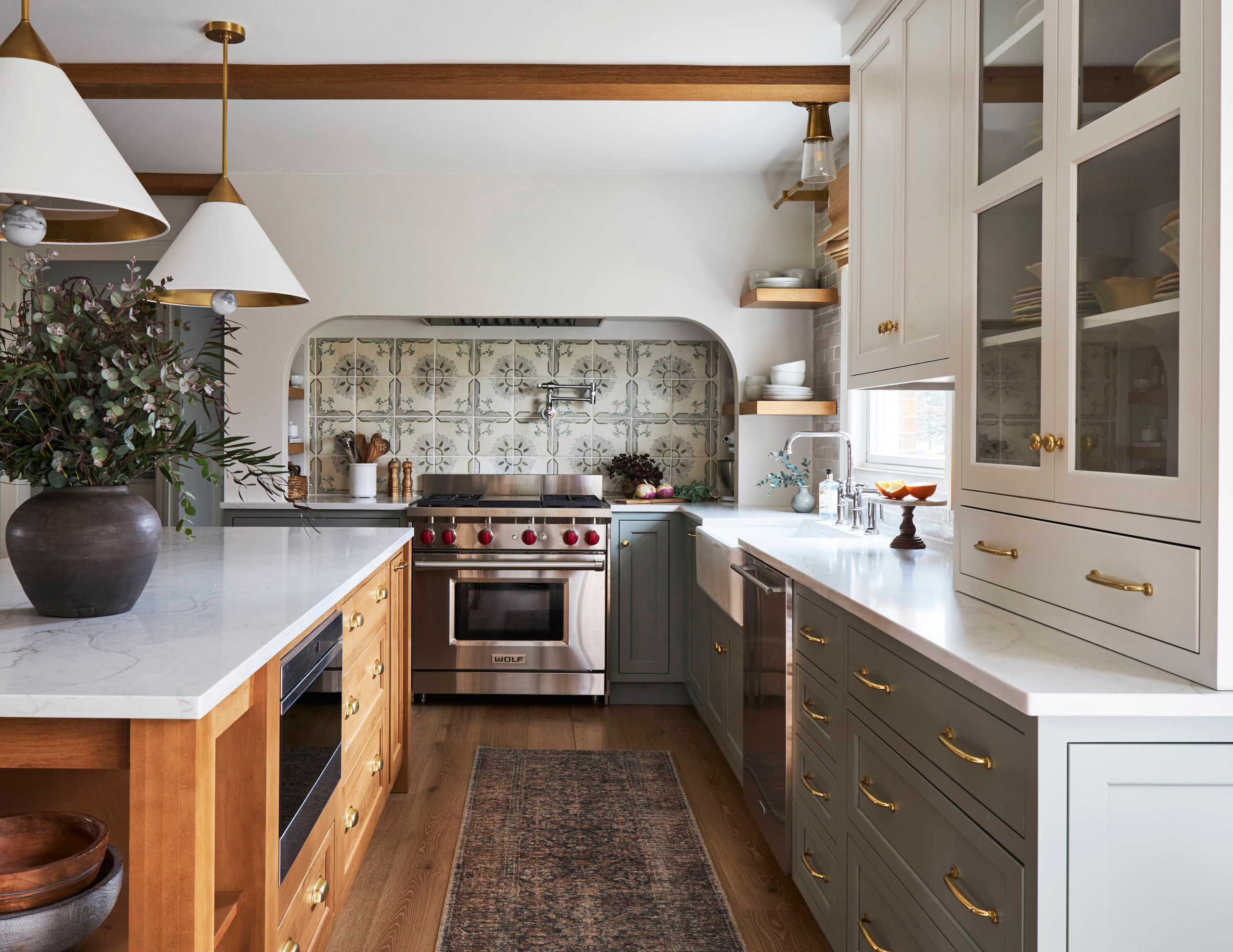
    1. Inadequate Circulation Space

    Failing to allow enough circulation space can make a kitchen feel cramped and restrict the number of people who can comfortably use the space at the same time, says Jenefer Gordon, principal at interior design firm Eat Bathe Live. “It causes even more issues when your kitchen doubles as a thoroughfare. A lack of space can also make it difficult to open appliances such as the fridge and dishwasher,” she says.

    Solution:
     To provide adequate circulation, try to have about 4 feet of space between kitchen countertops, Gordon says. Allow a little more room if there is a thoroughfare leading through the kitchen. “In a small kitchen, [39 inches] would be the minimum amount of space between countertops, but aim for more if you can,” she says.


    2. Not Planning Around the Workflow

    “A good kitchen workflow is essential. If you don’t have one, your kitchen will be inefficient, and you can end up running backwards and forwards between the different parts of your kitchen every time you cook, wash or prep,” Gordon says.

    Solution: In the planning stages, carefully consider how you use your kitchen, she says. She suggests increasing functionality by including storage for spices and oils near the cooking zone and storing cutlery and dishes near the dishwasher. “You’ll find many smart solutions on the market, including wide drawers and tailored inserts that facilitate high-functioning storage,” Gordon says.


    3. Not Measuring Appliances

    Lack of planning when it comes to appliances can lead to excessive protrusion from oversize refrigerators. “This can affect the ability to open cabinets and other appliances in your kitchen, and reduce circulation space,” Gordon says.

    Not measuring small appliances like microwaves, blenders and food processors can be an issue too. Without a proper home, they can end up sitting out on the counter and creating clutter, she says.

    Solution: Select appliances well in advance, checking the dimensions and the way appliances open to ensure that your kitchen layout can accommodate them in concealed, tailored storage, Gordon says. This also applies to pots and pans.


    4. Poor Lighting Placement

    If you don’t put the right light fixtures over your countertops, you will end up prepping, cooking and cleaning up in the shadows, says designer Naomi Findlay.
    “Another common lighting mistake is prioritizing aesthetics over functionality. Pretty pendants are beautiful, but if they don’t shine enough light over your work surfaces, they will not be practical,” she says.

    Solution: Findlay recommends positioning lighting slightly in front of you rather than directly overhead or behind you. Installing downlights, pendant lights and sconces on separate circuits makes it easier to control your lighting levels and atmosphere, she says. And don’t forget to choose bulbs that emit sufficient light, so you can see what you’re doing when you’re chopping and cooking.


    5. Forgetting About Function

    When planning your remodel, make sure you put your kitchen’s busiest areas — the sink, stove and fridge — in practical locations that are relevant to one another while allowing enough space for people to use and access them comfortably, Findlay says.

    When choosing cabinetry, make sure the doors won’t block your workflow when they’re open, she says. “The last thing you want is your fridge and cupboard doors banging into each other every time you open them!”

    Solution: Plan your kitchen layout as far in advance as possible, and choose your appliances before you start looking at cabinetry, Findlay says. “This will allow you to fit your units around your appliances, rather than the other way around, giving you a seamless look that’s both smart and space-efficient.”

    Tip: Think about how many people live in your home and will be using the kitchen at one time, she says. If it’s going to get crowded, you may have crammed too many elements into the kitchen layout and may want to consider scaling back.


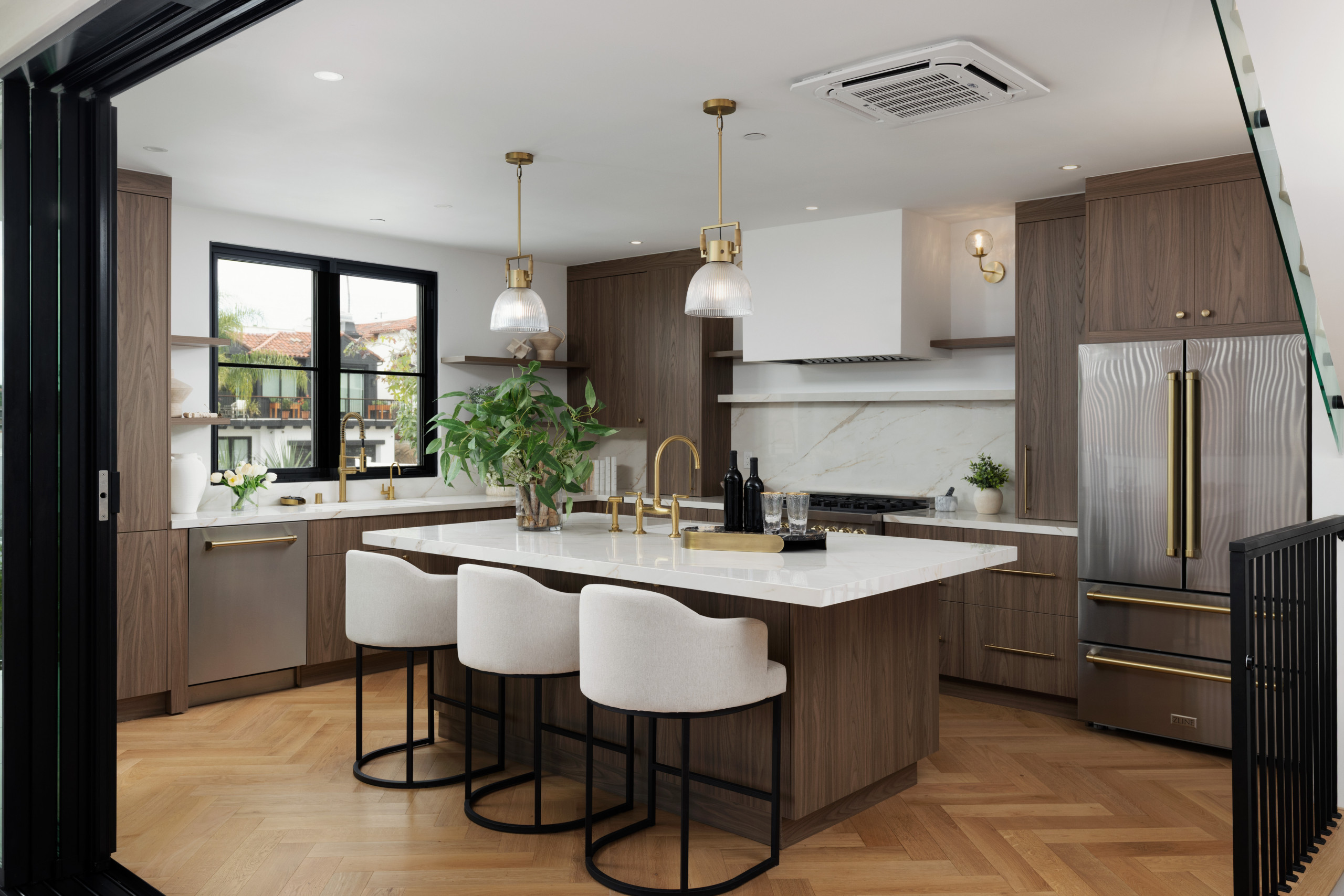
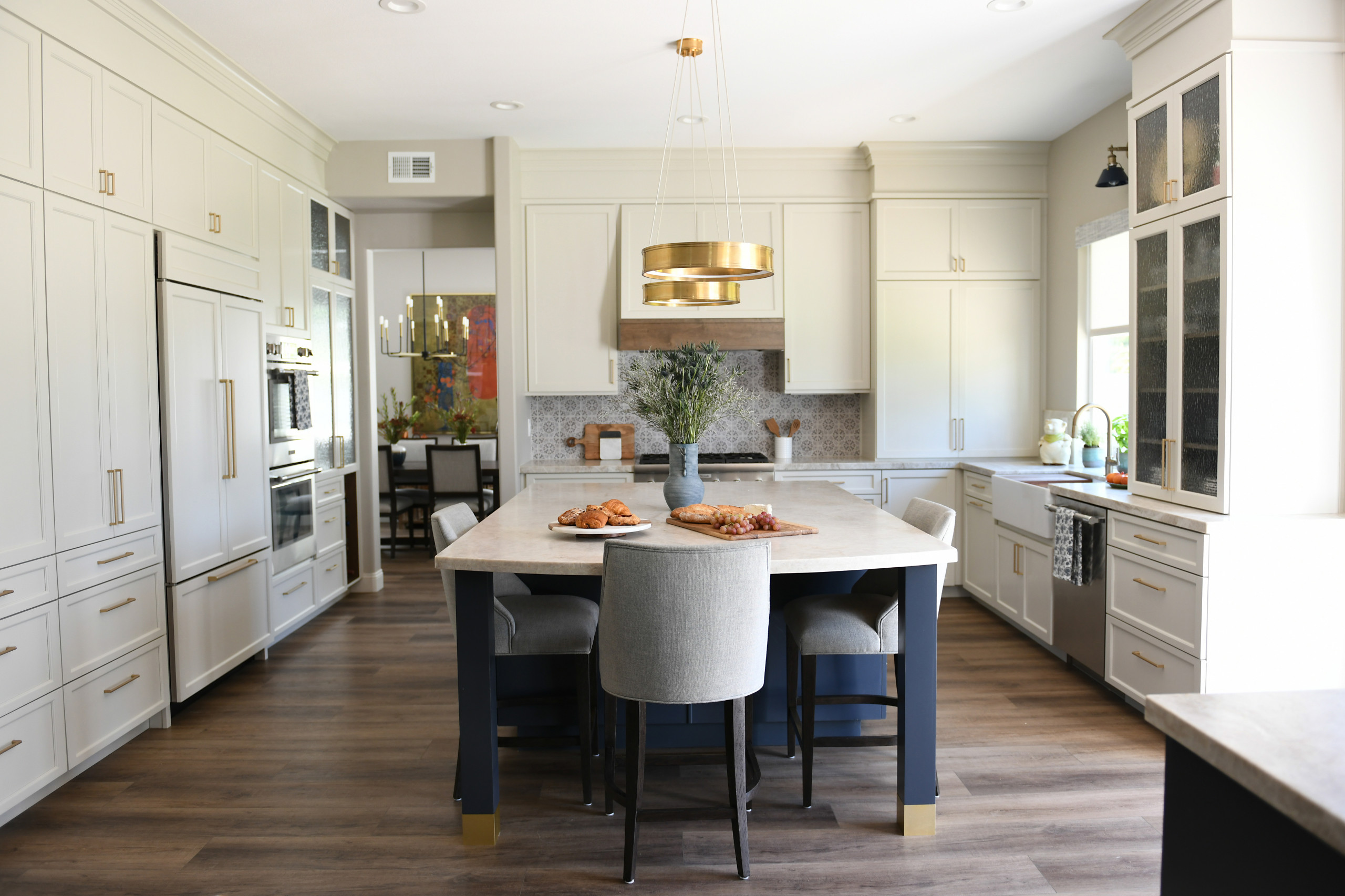
    6. Wasted Space on a Kitchen Island

    Kitchen islands are great for increasing your prep and storage space but will work only if you have the room, Findlay says. If your kitchen is small, an island can be a waste of space.

    “Placing an island in the wrong spot is another recipe for disaster,” she says. “A poorly positioned island can obstruct the flow of traffic to and from the sink, refrigerator, stove and primary workstations, creating a bottleneck in your kitchen.”

    Solution: Choose an island only if your kitchen can accommodate it or specify a narrow one. Findlay suggests having about 40 inches on both sides of the island for good traffic flow. “Deciding how big or small your island unit should be will depend on what it needs to house and the proportions of your kitchen,” she says. “I would recommend a minimum width of [about 47 inches] for a kitchen island. But if you don’t plan on installing a sink or a stovetop in it, you could go as narrow as [about 24 inches] in width.”


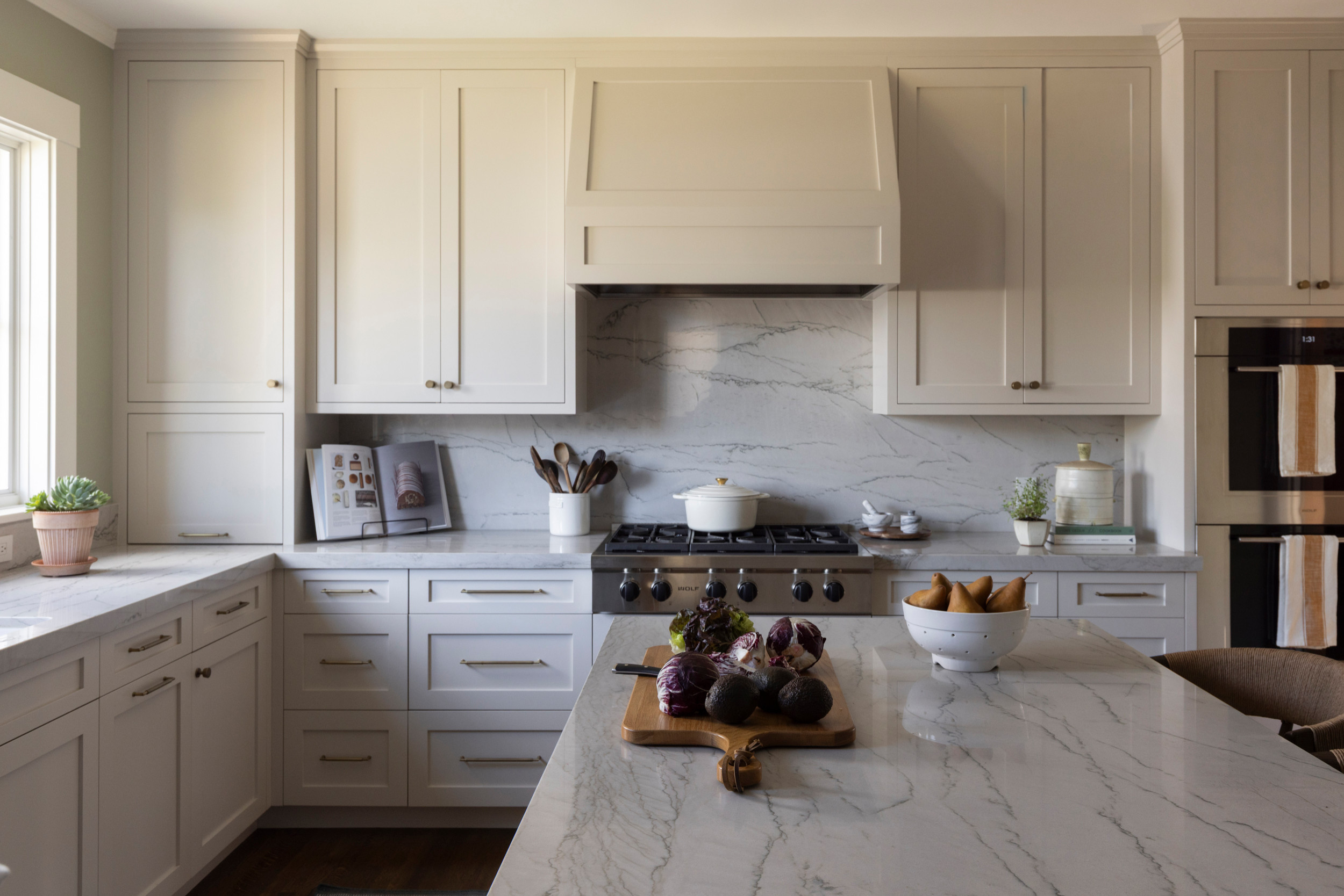
    7. Inadequate Space Between the Sink and the Stove

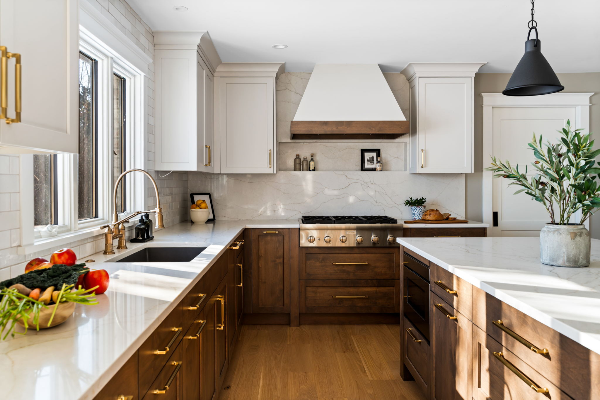
    The area between the sink and the stove is the main food preparation area, so although there are no set guidelines, you’ll want a decent expanse of countertop space there, says Cherie Barber, owner of Renovating for Profit, which offers online instruction in remodeling.

    Solution: When planning your kitchen, make sure the layout meets the practical day-to-day needs of the kitchen user, she says.


    8. Poorly Positioned Cabinet Doors and Drawers

    Cabinet doors and drawers can end up blocking doorways and walkways when they’re opened, Barber warns.

    Solution: “Planning is key,” she says. “Before you commit to a layout, think about how and where all the elements in your kitchen will open, including cupboards, drawers, the fridge and dishwasher, and how people will move through the space.”


    9. Not Maximizing Vertical Wall Space

    In a small kitchen, every bit of space counts, and your walls offer valuable storage real estate, Barber says.

    Solution: “Taking your cupboards right up to the ceiling will maximize your storage potential in a compact kitchen,” she says. “If you don’t like the idea of rows of closed-door cupboards, you can always mix it up with open shelving.”

    Tip: If your wall cabinets are positioned over a cooktop, minimum clearance rules apply, Barber says. The minimum requirements can vary for electric and gas cooktops, and range from 2 to 3 feet, she says.


    10. Assuming You Need a New Layout

    “I’d never automatically dismiss the existing layout of a kitchen,” Barber says. “It’s often planned that way for very practical reasons, such as placement of doors and windows and the most logical traffic flow.”

    Solution: A tweak to the layout, such as making it open plan or adding a breakfast bar or an island, may be all that’s needed, she says. This can save money because you won’t have to move electrical and plumbing systems.

    “If you’re designing a kitchen layout from scratch, address the practical considerations first: How many people will be using the kitchen on a regular basis? Do you do a lot of entertaining?” she says. “This will help you work out the kitchen’s size and function.”

    Then consider how the work triangle — cooktop, sink and fridge — will best fit your layout, she says. Allow enough space between the three points of the triangle, so you’re not walking yards between them every time you use your kitchen.

  • Kitchen With Clever Storage in a 16th-Century Space

    The low, beamed ceiling in this room in a centuries-old English house presented a challenge for kitchen specialist Chisholm Design. The firm had been tasked with creating a kitchen here where there once was none. In doing so, they needed to incorporate plentiful storage without the space feeling cramped. This was especially important because the front of the home dates from the 18th or early 19th century, with high ceilings and big windows, and the back of the house, where the kitchen is located, is 16th century, with low ceilings.

    “There’s quite a mismatch in the feel of the house as you go through it, so it was important the spaces flowed together,” designer Joanna Chisholm says. She did this by keeping the kitchen light and open, so the low ceiling and reduced light is less apparent, and by building storage neatly into all the available space, including under the stairs and within the fireplace.

    Before: “The clients had recently bought the house and it was a complete mess — it didn’t have a kitchen in it when we first got there,” Chisholm says. “They had quite a lot of work to do to the building — part of the outside wall was collapsing.”

    They needed to level the floor, replace the windows, repoint some of the internal brickwork and replace the post in the middle of the room. “It wasn’t fit to hold up the house,” she says.

    After: The designers made sure they kept some of the original “wonkiness” of the room. “The clients were really keen that we retain as much of that as possible because they wanted it to feel like an old house,” Chisholm says.

    The team fitted a sturdy new oak pillar to replace the weak post and incorporated it into the end of the island to ensure they could still give the couple a good-sized breakfast bar.

    In addition to wanting to make the most of every inch in the kitchen, the homeowners requested a large island. “They do a lot of socializing so they wanted to be able to gather around the island and, because the dining table isn’t in the kitchen, they also needed to be able to sit there comfortably for meals,” Chisholm says.

    They also asked for a big sink so they could easily soak baking sheets and large pans, and plenty of food and dish storage as they were aware there wasn’t much room for wall cabinets.

    Keeping the space as light as possible was important. “It’s south-facing, but on a dull day there isn’t a huge amount of light coming in,” she says. Along with painting the walls and ceiling white, she’s chosen pale limestone for the flooring and a pale but — crucially — warm neutral for the perimeter cabinets.

    The island has been given definition with a gray-green paint. “The clients wanted the kitchen to feel calm and connected to the garden, which is why they opted for the green,” Chisholm says.

    Chisholm has left gaps between the new oak pillar and the quartz upstand that wraps around it because of the nature of the wood. “The oak is going to move over time, so we couldn’t put a bead of silicone around it as we usually would,” she says.

    To help compensate for the lack of wall units in the rest of the kitchen, Chisholm designed this bank of tall cabinets containing masses of storage.

    In the middle is a breakfast bar with drawers below. The bifold doors can be left open without getting in the way so the room can benefit from the interior lights.

    The tall cabinet on the left contains shelving for additional items such as serving dishes, while the cabinet on the right is a pantry with spice racks on the doors, roomy shelves and open drawers at the bottom.

    Before: The old staircase, to the right of where the tall cabinets are now, wasn’t functional. The floor needed to be lowered and the ceiling beams replaced on this side of the room.

    After: The staircase has been replaced. The cupboard at the back of the stairs is a larder refrigerator, which doesn’t contain an ice box. The freezer is in the laundry room, just seen inside the open door.

    It was a tight fit to get the tall appliance into the sloping space. “The builders often don’t put stairs in until quite late so we had to wait until they were properly in, then measure the angle and depth [of the space] to make sure we could physically get the [refrigerator] in before ordering it,” Chisholm says.

    The thickness of the floor tiles had to be taken into account too. “We’re mindful of buildup,” Chisholm says. “If a builder puts [an inch] on the wall or floor, for example, it can make a massive difference.”

    The brass ventilation grille above the door is a smart detail that works nicely with the beams.

    The oak wine rack was also a challenge. “We had to make sure the fridge didn’t heat up the bottles, so there’s some extra insulation in there,” Chisholm says.

    There are no radiators in here so the team laid underfloor heating beneath the limestone tile.

    Three black-and-brass pendant lights hang over the island. The electrical conduit running along the beam is actually white plastic, which was massively cheaper than a brass version. “The homeowner did a very clever job of getting it to look like brass by spray-painting it,” Chisholm says.

    In addition to the island pendants, there are discreet white flush spotlights dotted between some of the beams, as well as lighting within and below the glass wall cabinet, above the range and in all the tall cabinets.

    The double doors seen here lead into the dining room, which is more of a formal dining space.

    The island is large — 8 feet by 3⅓ feet — but Chisholm has softened it with curves. “I do think they make a difference,” she says. “[The clients] didn’t want lots of curves, but the one on the end of the sink run, for instance, is nice, because that’s a walkway into a study so it softens it. I think if it had been square, it might have been a bit harsh.”

    The open end of the tall unit is also curved, but Chisholm hasn’t gone overboard. “We don’t have them on the sides of the wall cupboard, for example, as you can over-curve things if you’re not careful,” she says.

    “The cabinets are our country Shaker design,” she says. “There’s a little bit of beading inside the frames just to give that more traditional look, which goes with the house.”

    Most of the day-to-day dishware, pans and flatware live in the island, while a wooden tray and two cutting boards have their own slots in the side. “They add a bit of warmth and tie in with beams,” Chisholm says.

    Chisholm has built in one upper cabinet, making the most of this little space. The unit is tucked right up against the beam, with the trim cut to fit.

    The cupboard doors are glass, so the room can benefit from the interior lighting “and it doesn’t feel as heavy as a solid door,” Chisholm says. “The glass is fluted so you can hide things a little that aren’t necessarily beautiful but still get the light.”

    The part-glass back door brings in extra light. The barn door style means the owners can open just the top half to prevent the dog from escaping.

    The 1½ bowl farmhouse sink by Thomas Denby is an unusual configuration, having a big 20-inch-wide bowl on one side, and a little 8-inch bowl on the other. “It’s the best of both worlds,” Chisholm says. “A double [farmhouse] sink tends to have two smallish bowls. The client was keen to have one where she could properly soak things.”

    The sink is flanked by a dishwasher and a cabinet for trash bins.

    The clients wanted a freestanding range cooker, which has multiple ovens, a grill and burners. “It fits with the house and also there wasn’t a lot of room to have ovens in a tall tower,” Chisholm says.

    She managed to make use of the original fireplace, but “it was very wonky. It was tricky to get an extractor [range hood] in without a lot of digging around in the ceiling, but the builder did a brilliant job of getting the ducting up, across the ceiling and out,” she says.

    The wood lintel and brickwork are original. “The clients were really keen on it not all being made straight and keeping its character,” Chisholm says. The antique mirror backsplash reflects the light and goes with the feel of the room.

    The cupboards on either side of the range are quite shallow as it’s such a deep fireplace, but they’re perfect for oils, herbs and spices. “They work really well there, otherwise the larder is quite far away at the other side of the kitchen,” Chisholm says.

    Chisholm has also made brilliant use of the space in the adjacent laundry-mudroom.

    On the mudroom side, ceiling-high cabinets, painted in the same color as the kitchen cabinets, hide a large Megaflo hot water cylinder, the boiler and a water softener. “There was a lot of plumbing to be thought about,” Chisholm says. Laundry rooms “can be tricky because of all the plumbing, and you can’t really measure until all that plumbing is in.”

    To the left are coat hooks and a bench with a drawer underneath for hats and gloves, as well as a cupboard for rain boots with baskets above.

    On the laundry side, there’s a tall freezer within easy reach of the kitchen, then a stacked washing machine and dryer, and storage for cleaning and laundry essentials. Chisholm also included a dog shower for after muddy walks.
  • Kitchen With Clever Storage in a 16th-Century Space

    The low, beamed ceiling in this room in a centuries-old English house presented a challenge for kitchen specialist Chisholm Design. The firm had been tasked with creating a kitchen here where there once was none. In doing so, they needed to incorporate plentiful storage without the space feeling cramped. This was especially important because the front of the home dates from the 18th or early 19th century, with high ceilings and big windows, and the back of the house, where the kitchen is located, is 16th century, with low ceilings.

    “There’s quite a mismatch in the feel of the house as you go through it, so it was important the spaces flowed together,” designer Joanna Chisholm says. She did this by keeping the kitchen light and open, so the low ceiling and reduced light is less apparent, and by building storage neatly into all the available space, including under the stairs and within the fireplace.

    Before: “The clients had recently bought the house and it was a complete mess — it didn’t have a kitchen in it when we first got there,” Chisholm says. “They had quite a lot of work to do to the building — part of the outside wall was collapsing.”

    They needed to level the floor, replace the windows, repoint some of the internal brickwork and replace the post in the middle of the room. “It wasn’t fit to hold up the house,” she says.

    After: The designers made sure they kept some of the original “wonkiness” of the room. “The clients were really keen that we retain as much of that as possible because they wanted it to feel like an old house,” Chisholm says.

    The team fitted a sturdy new oak pillar to replace the weak post and incorporated it into the end of the island to ensure they could still give the couple a good-sized breakfast bar.

    In addition to wanting to make the most of every inch in the kitchen, the homeowners requested a large island. “They do a lot of socializing so they wanted to be able to gather around the island and, because the dining table isn’t in the kitchen, they also needed to be able to sit there comfortably for meals,” Chisholm says.

    They also asked for a big sink so they could easily soak baking sheets and large pans, and plenty of food and dish storage as they were aware there wasn’t much room for wall cabinets.

    Keeping the space as light as possible was important. “It’s south-facing, but on a dull day there isn’t a huge amount of light coming in,” she says. Along with painting the walls and ceiling white, she’s chosen pale limestone for the flooring and a pale but — crucially — warm neutral for the perimeter cabinets.

    The island has been given definition with a gray-green paint. “The clients wanted the kitchen to feel calm and connected to the garden, which is why they opted for the green,” Chisholm says.

    Chisholm has left gaps between the new oak pillar and the quartz upstand that wraps around it because of the nature of the wood. “The oak is going to move over time, so we couldn’t put a bead of silicone around it as we usually would,” she says.

    To help compensate for the lack of wall units in the rest of the kitchen, Chisholm designed this bank of tall cabinets containing masses of storage.

    In the middle is a breakfast bar with drawers below. The bifold doors can be left open without getting in the way so the room can benefit from the interior lights.

    The tall cabinet on the left contains shelving for additional items such as serving dishes, while the cabinet on the right is a pantry with spice racks on the doors, roomy shelves and open drawers at the bottom.

    Before: The old staircase, to the right of where the tall cabinets are now, wasn’t functional. The floor needed to be lowered and the ceiling beams replaced on this side of the room.

    After: The staircase has been replaced. The cupboard at the back of the stairs is a larder refrigerator, which doesn’t contain an ice box. The freezer is in the laundry room, just seen inside the open door.

    It was a tight fit to get the tall appliance into the sloping space. “The builders often don’t put stairs in until quite late so we had to wait until they were properly in, then measure the angle and depth [of the space] to make sure we could physically get the [refrigerator] in before ordering it,” Chisholm says.

    The thickness of the floor tiles had to be taken into account too. “We’re mindful of buildup,” Chisholm says. “If a builder puts [an inch] on the wall or floor, for example, it can make a massive difference.”

    The brass ventilation grille above the door is a smart detail that works nicely with the beams.

    The oak wine rack was also a challenge. “We had to make sure the fridge didn’t heat up the bottles, so there’s some extra insulation in there,” Chisholm says.

    There are no radiators in here so the team laid underfloor heating beneath the limestone tile.

    Three black-and-brass pendant lights hang over the island. The electrical conduit running along the beam is actually white plastic, which was massively cheaper than a brass version. “The homeowner did a very clever job of getting it to look like brass by spray-painting it,” Chisholm says.

    In addition to the island pendants, there are discreet white flush spotlights dotted between some of the beams, as well as lighting within and below the glass wall cabinet, above the range and in all the tall cabinets.

    The double doors seen here lead into the dining room, which is more of a formal dining space.

    The island is large — 8 feet by 3⅓ feet — but Chisholm has softened it with curves. “I do think they make a difference,” she says. “[The clients] didn’t want lots of curves, but the one on the end of the sink run, for instance, is nice, because that’s a walkway into a study so it softens it. I think if it had been square, it might have been a bit harsh.”

    The open end of the tall unit is also curved, but Chisholm hasn’t gone overboard. “We don’t have them on the sides of the wall cupboard, for example, as you can over-curve things if you’re not careful,” she says.

    “The cabinets are our country Shaker design,” she says. “There’s a little bit of beading inside the frames just to give that more traditional look, which goes with the house.”

    Most of the day-to-day dishware, pans and flatware live in the island, while a wooden tray and two cutting boards have their own slots in the side. “They add a bit of warmth and tie in with beams,” Chisholm says.

    Chisholm has built in one upper cabinet, making the most of this little space. The unit is tucked right up against the beam, with the trim cut to fit.

    The cupboard doors are glass, so the room can benefit from the interior lighting “and it doesn’t feel as heavy as a solid door,” Chisholm says. “The glass is fluted so you can hide things a little that aren’t necessarily beautiful but still get the light.”

    The part-glass back door brings in extra light. The barn door style means the owners can open just the top half to prevent the dog from escaping.

    The 1½ bowl farmhouse sink by Thomas Denby is an unusual configuration, having a big 20-inch-wide bowl on one side, and a little 8-inch bowl on the other. “It’s the best of both worlds,” Chisholm says. “A double [farmhouse] sink tends to have two smallish bowls. The client was keen to have one where she could properly soak things.”

    The sink is flanked by a dishwasher and a cabinet for trash bins.

    The clients wanted a freestanding range cooker, which has multiple ovens, a grill and burners. “It fits with the house and also there wasn’t a lot of room to have ovens in a tall tower,” Chisholm says.

    She managed to make use of the original fireplace, but “it was very wonky. It was tricky to get an extractor [range hood] in without a lot of digging around in the ceiling, but the builder did a brilliant job of getting the ducting up, across the ceiling and out,” she says.

    The wood lintel and brickwork are original. “The clients were really keen on it not all being made straight and keeping its character,” Chisholm says. The antique mirror backsplash reflects the light and goes with the feel of the room.

    The cupboards on either side of the range are quite shallow as it’s such a deep fireplace, but they’re perfect for oils, herbs and spices. “They work really well there, otherwise the larder is quite far away at the other side of the kitchen,” Chisholm says.

    Chisholm has also made brilliant use of the space in the adjacent laundry-mudroom.

    On the mudroom side, ceiling-high cabinets, painted in the same color as the kitchen cabinets, hide a large Megaflo hot water cylinder, the boiler and a water softener. “There was a lot of plumbing to be thought about,” Chisholm says. Laundry rooms “can be tricky because of all the plumbing, and you can’t really measure until all that plumbing is in.”

    To the left are coat hooks and a bench with a drawer underneath for hats and gloves, as well as a cupboard for rain boots with baskets above.

    On the laundry side, there’s a tall freezer within easy reach of the kitchen, then a stacked washing machine and dryer, and storage for cleaning and laundry essentials. Chisholm also included a dog shower for after muddy walks.
  • Before and After: 4 Inspiring Kitchens in 320 to 350 Square Feet

    A kitchen that measures 320 to 350 square feet offers tons of roomy potential. The abundant space allows for an open layout, optimized cooking zones and enhanced entertaining, all with plenty of elbow room. Here, before-and-after photos of four uplifting kitchen remodels show a little of what’s possible.


    1. Charming and Cheerful

    Before: This aging Delafield, Wisconsin, kitchen had dark cabinetry and countertops that gave it a heavy, shadowy look. An off-center stainless steel range, backsplash and hood dominated a back wall. The refrigerator stood on a wall to the right of the range, out of view, across from the sink and separated from it by the island, creating an inefficient workflow. The only pantry was located down the hall, accessed through a mudroom.

    The homeowners, a couple with grown children and two dogs, wanted a kitchen with improved storage, a more efficient layout and a fresh look with an antique English sensibility. For help, they hired design-build firm Refined Renovations.

    After: After removing and donating what they could from the old kitchen, the Refined Renovations design and production teams had a blank canvas. Drawing inspiration from historical English kitchens and sculleries, this cheerful and charming makeover spearheaded by lead designer Morgan Taugher includes painted custom inset perimeter cabinets surrounding a stained oak island, all topped with marble-like Matarazzo quartzite.

    Slightly shifting the location of the sink, placing the new paneled refrigerator to its left, centering a smaller range on the back wall and rotating the island 90 degrees created a more user-friendly layout. The furniture-look island, new decorative ceiling beams and refinished and stained hardwood floor add warmth. A bank of tall windows measuring just over 6 feet wide lets in abundant sunshine.

    2. Light and Lofty

    Before: This Las Vegas kitchen had a dark and dated 1990s Mediterranean style the homeowners disliked. A soffit wrapping the room forced the upper cabinets down, creating a closed-in feel. Tile flooring was cold and hard on the feet. And the small office niche in the back corner sat mostly unused.

    But the couple, parents of four kids, had a keen fondness for the impressive arched opening between the kitchen and breakfast room. Wanting a brighter space with high-end appliances and a more custom look, the couple turned to designer Rebecca Zajac.


    After: Using the arched opening as inspiration, Zajac designed a modern Spanish-style kitchen. She repeated the arch motif with an arched opening to a new butler’s pantry, an arched custom range hood and arch details on a new black-stained oak island.

    The removal of the soffit allowed Zajac to take a couple of banks of upper cabinets flanking the range all the way to the raised ceiling. The creamy white Shaker-style perimeter cabinets, soft white walls and marble-look porcelain countertops all deliver a light and airy look. A new engineered white oak floor adds warmth. Brass stools at the island coordinate with unlacquered brass cabinet knobs and pulls. Pendant lights over the island feature white plaster shades and a natural rusted iron finish.

    3. Modern and Warm

    Before: The forest setting of this Woodland, Minnesota, home was a big influence on the design. Lots of large windows brought the woodsy feeling indoors. But a large vent hood over the island was a head banger and blocked all the sightlines across the kitchen. The kitchen also felt enclosed and cut off from adjacent rooms.

    Most of the finishes in the kitchen dated back to 1978, so they showed the wear and tear of almost half a century of use. The homeowners wanted a more livable and attractive space, and turned to interior designer Colleen Slack for help.

    After: The designer used Houzz photos to communicate ideas to her clients and help find the exact style they wanted. Creating a space that would be warm modern but not specifically midcentury modern with details that were refined but not elegant were big goals.

    With the large vent hood gone, views across the kitchen are clear and the space is brighter and airier. Walnut cabinetry, a granite waterfall island bar, high-end appliances, a cozy banquette and a more open feel between rooms are just a few of the fully remodeled kitchen’s new assets. Meticulously book-matched cabinetry provides continuous horizontal graining patterns. Backsplash tiles with finished edges and large-format floor tiles that were painstakingly laid out in drawings on-site are other details that bring this livable space to the next level.

    4. Elegant and Functional

    Before: In this aging 1970s Davis, California, space, a peninsula divided the kitchen from the dining area to the left. White tile countertops, dated and aged parquet wood flooring, basic wood cabinets and the lack of a backsplash and sufficient storage did little to energize the look and feel.

    A former pantry can be seen at the back left. The brown door at the rear of the short hallway connects to the garage. The brown door on the right side of the short hallway leads to a closet, which the homeowners thought could be put to better use. Wanting to create an inviting and stylish kitchen where their family and friends could gather while they prepared meals, these empty-nest homeowners returned to designer Kellie Love, who had helped them renovate their laundry room and hall bathroom.

    After: Love eliminated the peninsula to open up the space. An island with seating anchors the new layout. A beloved piece of ceramic dishware from the homeowners’ collection inspired the warm and elegant color palette. Matte sage green perimeter cabinets (Herbes de Provence by Benjamin Moore) improve storage and offer a warm complement to the rift-cut white oak base of the island.

    Love transformed the pantry into a hutch-style built-in with glass-front upper cabinets that display the couple’s dishes. LED lights inside and underneath the cabinets help illuminate the area and create a warm glow at night. A new door to the garage has a touch keypad lock and lever handle in polished chrome. A new pocket door to the left of the fridge connects to a new walk-in pantry that replaced the former utility closet. The updated backsplash has 2½-by-10-inch matte white ceramic tiles in a horizontally stacked pattern. The warm, elegant style ensures the design will look stylish for years to come.

  • Before and After: 4 Versatile Kitchens in 310 to 370 Square Feet

    Kitchens that measure between 310 and 370 square feet offer room to stretch out — and to get creative. These medium-to-large spaces often come with enough square footage for better flow, generous storage and flexible island seating options, making them ideal for both everyday living and entertaining. To see what’s possible, check out how these design and remodeling pros transformed outdated or inefficient kitchens into stylish, functional hubs full of clever ideas and thoughtful details.

    1. Organic Modern Refresh With Streamlined Style

    Before: This Calabasas, California, couple appreciated the overall layout of their 2002 Spanish-style kitchen, as well as the rich stone tile flooring, decorative wood ceiling beams and pro-style appliances. But the ornate cabinet details, busy backsplash and green granite countertops didn’t match their style.

    Looking to create a more timeless feel with clean lines and an organic modern aesthetic, they brought in designer Sarah West to help elevate and streamline the space.

    After: While the original footprint stayed the same, West replaced the ornate cabinets, backsplash, countertops and island, thoughtfully integrating the elements the homeowners wanted to keep.

    Custom rift-cut white oak cabinetry combines Shaker-style doors and slab-front drawers, accented with a mix of oil-rubbed bronze knobs and pulls. A warm greige paint (Classic Gray by Benjamin Moore) covers the upper cabinets on the right, while creamy white walls (Swiss Coffee by Benjamin Moore) and a zellige tile backsplash tie the palette together.

    West removed the decorative wood trim on the hood, then reframed part of the hood and reshaped the corners for a cleaner look. A new plaster finish gives it a soft, refined feel, while a brushed bronze pot filler and shelf below add a touch of character.

    Backless leather-and-wood counter stools offer casual seating on three sides of the new island, which features post and foot details that give it a freestanding furniture look. Warm gray quartz countertops with soft charcoal veining complement the kitchen’s neutral palette. Three modern conical pendant lights with glass shades and oil-rubbed bronze finishes add a sophisticated touch.

    West also removed millwork that had previously blocked the arched sink window, opening up the view and emphasizing the curve, an elegant nod to organic modern style.


    2. Family-Friendly Expansion With Clever Storage

    Before: This Minneapolis couple and their three kids loved cooking and baking together. But the cramped U-shaped kitchen in their 1904 home didn’t support their lifestyle. A range wall on the right closed the kitchen off from a mudroom and an underused space, while worn white cabinets, dated finishes and aging appliances added to the frustration. The only element they wanted to keep was the red oak flooring, which just needed patching.

    To create a more open, functional kitchen with better storage, improved flow and a style tailored to the family, they brought in designer Kate Roos for a full remodel.

    After: Roos removed the range wall to extend the kitchen into the former mudroom, adding 45 square feet to the layout. The expansion made room for a compact walnut island that offers seating, storage and prep space. It also includes a clever rolling baking cart that tucks neatly underneath when not in use. The wood tones warm up the space and coordinate with the custom walnut range hood.

    Light gray perimeter cabinets and 3-by-8-inch white ceramic tiles keep the space bright and airy. A handmade backsplash on the range wall adds a spark of personality with a mix of amber, gray and espresso tones.

    The new sink wall — previously part of the mudroom — features a 36-inch white cast-iron farmhouse sink with a basin rack and a stainless steel pull-down faucet with magnetic docking. The existing stainless steel dishwasher sits to the right, while pullouts on either side of the sink keep dish towels and essentials organized. A 24-inch drawer microwave is tucked into the island’s interior side. Across the room, a 36-inch French door refrigerator is surrounded by a mix of open and closed storage.

    A new glass back door leads to a new mudroom with a built-in walnut bench that ties in with the other warm walnut details throughout this now functional, family-friendly kitchen.


    3. Elegant Overhaul With Smart Layout Tweaks

    Before: After nearly 25 years in their upscale Carlsbad, California, tract home, this couple were ready to update their aging kitchen. They had grown tired of the brown granite countertops and backsplash, brown slate tile flooring and green cabinets that lacked sufficient storage. While the sink on the right and range top on the back wall functioned well, the left-side refrigerator wall was less efficient, with an angled doorway leading to a small butler’s pantry and an awkward walk-in pantry beside the fridge. A desk area (not shown) on the sink wall and a dining table placed too close to the island further disrupted flow.

    After: Ramsay reworked the layout by removing the butler’s pantry, straightening the angled corner and creating a more streamlined run of cabinetry. She also replaced the awkward walk-in pantry with tall pantry cabinets to the left of the fridge, turning that wall into a sleek, functional storage zone.

    Eliminating the dining table opened up space for a 5-by-8-foot navy blue island with seating on three sides, allowing guests to comfortably face each other. The bold island contrasts with creamy warm beige perimeter cabinets (Dumpling by Sherwin-Williams), crafted from paint-grade maple with beaded inset Shaker-style fronts. Wood-look luxury vinyl flooring brings additional warmth and durability to the space.

    The island’s base, painted in Hale Navy by Benjamin Moore, grounds the space with a rich, saturated hue. Blue-and-white chambray performance fabric on the counter stools complements the color while adding soft texture. Gold caps on the island legs offer both elegance and durability, echoing the champagne-finish cabinet pulls and a pair of 18-inch antiqued burnished brass ring chandeliers above.

    By relocating the desk area to an adjacent wall — formerly home to a single glass door — Ramsay was able to install French doors that enhance the kitchen’s connection to the expansive backyard.


    4. Lake Retreat Upgrade With Space-Saving Moves

    Before: Tucked into the woods on an island in Lake Champlain, Vermont, this 1955 “seasonal camp” is where empty nesters Lance and Dawn Trigg host gatherings with family and friends. But the Florida-based couple felt the outdated kitchen wasn’t party-ready. Aging appliances, worn cabinets, extensive pine paneling, green linoleum flooring and blue-green laminate countertops made the space feel dark and dated. A clunky peninsula disrupted traffic flow, and an old staircase across from it took up valuable floor space. Though the existing windows offered lovely views, they were drafty and in need of replacement.

    After: The remodel team cleared out the old appliances, cabinets, countertops, flooring and peninsula, upgraded the electrical and plumbing, and replaced the bulky staircase with a compact spiral design set deeper into the house. This opened up 141 square feet, making room for a new island with added storage, seating, a beverage fridge and pullout liquor shelves.

    The island’s cool blue-green hue (Composed by Sherwin-Williams) pays tribute to the lake outside, while clean white perimeter cabinets with a touch of gray complement the painted greige wall panels (Grége Avenue by Benjamin Moore). A refinished pine ceiling and new rustic pine flooring in a natural finish add warmth and balance to the space.

    With the peninsula removed and the spiral staircase installed, Mee relocated the refrigerator to where a window once was. Efficient rollouts and dividers optimize storage around the fridge, while a 24-inch built-in microwave fits neatly into the busy pantry wall.

    The updated front door was shifted slightly to connect with a new porch and paved walkway. Moving the refrigerator freed up space for a mudroom wall packed with smart, functional storage solutions.

  • The 10 Most Popular Basements of 2026

    Basement renovations pose a specific set of challenges — low ceilings, a lack of natural light, egress requirements, utility storage, awkward ductwork and more. But Houzz designers and builders have met these challenges head-on, and the results are beyond the wildest of basement dreams. Here’s a countdown of the 10 most-saved basement photos of 2019. See if any of these popular designs can inspire your home plans.


    10. Contemporary Yet Cozy

    In this San Diego basement, the architects at Oasis Architecture & Design took advantage of the space beneath the stairs, transforming it into a C-shaped reading nook. The abstract mural’s horizontal lines emphasize length rather than height. And the pool cue rack integrated into the TV wall had many Houzzers taking notes as they saved this photo to their ideabooks.


    9. Beachy and Breezy

    A deep window well allowed for full-size windows in this basement in Alexandria, Virginia. Architect Laura Campbell played off the increase in natural light, infusing the room with a light, beachy style. Using tans and creams, rather than white, tones down coastal crispness for something warmer.


    8. Industrial Chic

    Platinum Design Build gave this Atlanta basement chic industrial style with exposed brick walls, caged light fixtures and accents of metal and wood. And painting the rafters allowed the designers to keep the ceiling as high as possible while sprucing up its look.

    7. Marked by Stunning Millwork

    Well-planned built-ins and other feats of carpentry make this Chicago-area basement a stunner. Bookshelves, cabinet doors with grilles, deep drawers for storage and handsome columns are just a few of the special custom touches designed and crafted by the team of Two Hands Interiors and De Groot Construction.

    6. Refined Rustic

    Cool gray-blues paired with wood textures give this Chicago basement a refined rustic-meets-industrial look. Reclaimed wood walls and furnishings of leather and hide bring in rustic elements while metallic finishes add shine. Beautiful upholstery elevates the entire space.

    5. Cozy Cabin Style

    Cushy leather sofas, plaid pillows, wood barn doors and a reclaimed wood accent wall give cozy cabin style to this Minneapolis basement by Mark D. Williams Custom Homes. Box beams on the ceiling make sense of the challenges posed by soffits and ductwork (a common issue in basement spaces). And well-planned built-ins keep media equipment, games and books organized.

    4. Rock ’n’ Roll Entertainment Space

    A Boston-area couple was craving a place to entertain friends on casual nights, complete with a pool table, a bar with wine storage and a home theater. So interior designer Kelly McGuill lightened up their existing red walls with white paint and redesigned the space. The new bar area contains a tall wine fridge and floor-to-ceiling wine racks. McGuill plucked the photographs of musicians from the homeowners’ art collection. “The basement is a real rock ’n’ roll space,” McGuill told Houzz.

    3. A Bright Underground Space

    A TV lounge, office space, a full kitchen and a full remodel of the existing 1970s bathroom were all on this Toronto couple’s basement remodel wish list. The creative team at Level Studio gave them a clean contemporary space, inspired by midcentury modern design and warmed by organic textures and colors. The accent wall, sculptural shelves and the green sofa were all a big hit with Houzz users.

    2. A Spot for a Soak

    This Chevy Chase, Maryland, basement has a workout space, so when planning a renovation for the adjacent bathroom, designer Jennifer Gilmer suggested a teak Japanese bathtub for post-workout soaks. The family wholeheartedly agreed, and the style of the tub inspired the rest of the basement bathroom’s design. This includes the teak shower floor and shelving as well as wavy 3D wall tiles. The result is a Japanese Zen-inspired respite.

     
    1. A Sports Fan’s Dream

    Sports were No. 1 when it came to designing this Northern Virginia rec room. It has three large-screen TVs for watching games or playing video games simultaneously. And for the non-spectators, there’s tabletop shuffleboard and lots of places to play board games or cards. The room is also set up for some put-the-TVs-on-mute conversation. And for serving beverages — off to the right, Metro Building and Remodeling built a bar complete with a sink, wine fridge, beer fridge, ice maker and dishwasher.

    Another element that can be tricky in a basement is flooring. The flooring seen here and in many of the other spaces in this roundup is a great option — it looks like hardwood flooring but is actually basement-friendly, low-maintenance, easy-to-install luxury vinyl tile.

  • Ten Popular New Bedrooms So Far in 2026

    A beautiful bedroom can help create a restful environment, especially if the room features sumptuous layered linens, light-limiting window treatments and soothing neutral colors.

    10. In the Treetops

    In an ODS Architecture-designed home in the hills of San Mateo, California, this bedroom has crisp modern lines, light neutral colors and soft textures. From the bed, the bench at its foot or the long built-in bench beneath the black-framed window, one can enjoy expansive views of the surrounding greenery. At bedtime, motorized blinds recessed in the soffit can be lowered for privacy and light control.

    9. Contempo Cozy

    Mister + Mrs Sharp softened this contemporary-style Atlanta bedroom with layered rugs, rounded furniture, thick wall-to-wall draperies hung on tracks and hotel-like bedding. Upholstery on the bed, bench and the legs of the side tables enhances the inviting feel. Matching smoky glass lamps echo the furniture’s curves and add a hint of 1970s style.

    8. Linen and Light

    The decor in this transitional-style bedroom may be neutral in tone, but it’s full of standout details, such as the flange on the upholstered bed and the tapestry pattern on the bolster pillow. In the Forest Hills, Tennessee, home by Megan Glenn Architecture, the room incorporates two layers of window dressings: inside-mount Roman shades and draperies hung on French return rods (which reduce light leakage at the window edges).

    7. Take a Seat

    Storie Collective took advantage of the large square footage of this Chevy Chase, Maryland, bedroom by adding a sitting area at the foot of the bed. Not only does it offer a place to read, relax and set down a cup of coffee or a glass of wine, but it also adds pattern and panache thanks to the settee’s checked upholstery and the coffee table’s marbled finish.

    6. Gingham Style

    This sweet girl’s bedroom in Orange County, California, by Alicia Torosian Design has a winning mix of geometric and floral patterns, muted pastel colors and medium-tone woods. Torosian, who uses Houzz Pro business software to manage her projects, brought the look together by matching the Roman shades and bolster pillow — a simultaneously nostalgic and on-trend touch.

    5. Elemental Elegance

    Uploaded by Home stagers Elite Austin, this stylish Texas bedroom boasts interesting architectural details, including a box-beam ceiling, a shallow paneled niche for the headboard, a fireplace and a walk-out bow window. The upholstered bed’s rounded and folded shape mirrors the curves in the stone fireplace surround, and layers of warm neutral colors and highly tactile textures enhance visual interest without competing with the room’s bones.

    4. Floral Flourishes

    The star of this Alexandria, Virginia, bedroom by Asha Maía Design is the deep green velvet bed, which gleams against a backdrop of floral grasscloth wallpaper. The small sunburst mirror above the headboard, the headboard’s nailhead trim, the brass lamps and the hardware on the dark wood nightstands add subtle touches of warmth and glamour.

    3. Deck Delight

    This crisp bedroom is in a spectacular waterfront house built by Maine contractors Wright-Ryan Homes. The walls and ceiling are wrapped in vertical wood paneling for a coastal feel that’s enhanced by the blue, white and sand-colored palette. Welcoming spots for afternoon naps include the upholstered bed, the snug sofa and a pair of sling-style chairs on the private deck.

    2. Under the Darkness

    The water view alone makes this bedroom in a Pequot Lakes, Minnesota, home special. Designed by Mårka Architecture and Houzz Pro software users Tays & Co, its dramatic black ceiling, wood-paneled walls and refined rustic style elevate the space even more. Additionally, the room is packed with clever, space-saving features, including a television that slides out from the wall next to the bump-out window, a closet that pulls out from the left and hidden drawers beneath the bench.

    1. Natural Pairing

    Kansas-based Jami Campbell Interiors designed this transitional-style bedroom with a rich, warm palette of navy, copper and beige, with touches of black and brass. The colors are highlighted in the geometric-patterned Moroccan-style rug and complement the reddish tones of the nightstands and slatted bench. White walls and an arched full-length mirror, which reflects sunlight streaming in through the large windows, balance the darker hues.

  • The 10 Most Popular New Entryways and Mudrooms So Far in 2026

    Savvy homeowners know that an entryway does more than greet guests — it sets the tone for the entire home while keeping daily life organized. Thoughtful storage and layout solutions help keep coats, bags and shoes in order while creating a stylish first impression that welcomes everyone who walks through the door. For inspiration on blending practicality with design, explore this countdown of the 10 most-saved new entryway and mudroom photos uploaded to Houzz so far in 2026.

    10. Easy Grab-and-Go

    This entry mudroom in a classic 1960s side-hall colonial in Philadelphia, refreshed by House of Grace Interiors, pairs simplicity with everyday function. A wall-mounted rack with hooks keeps totes, towels and outerwear within easy reach, supporting quick comings and goings. A vintage wood chair can be moved as needed and provides a convenient spot for changing shoes or pulling on boots. A wood console table with drawers offers space for plants while corralling keys, mail and small essentials. A checkerboard floor introduces lively pattern, and neutral walls and abundant natural light keep the compact space feeling bright and relaxed.


    9. Warm Modern Welcome

    A dramatic yet inviting entryway greets visitors at this modern retreat on Lake James in North Carolina by CBB Design Firm. A warm wood front door framed by sidelights and topped with transom windows draws in natural light while emphasizing the home’s tall proportions. Wide-plank wood flooring extends the sense of warmth, and a sculptural star-shaped chandelier casts a soft glow from above. Glass panels provide sightlines into an adjacent home office, adding openness to the layout. Stacked-stone surfaces and iron railings introduce texture and structure, echoing the refined material palette used throughout the home.


    8. Smart Space for Family Life

    Schloegel Design Remodel, which uses Houzz Pro software, transformed an awkward vestibule in this 1933 Prairie Village, Kansas, home into a hardworking 42-square-foot mudroom tailored to a busy family of five. Reorienting the layout and widening the room created more usable space, while replacing a traditional swing door with a pocket door reclaimed valuable square footage. A built-in bench with drawers below maximizes storage, and open cubbies topped with woven baskets keep everyday items within easy reach. Hexagonal tile flooring introduces lively pattern, and multicolored hooks installed high above the bench add a playful note.


    7. Ready for the Beach

    This newly built beach house in Plymouth, Massachusetts, by Thorson Restoration & Construction includes a 115-square-foot mudroom designed to handle sandy, post-shore routines with ease. Custom built-in cabinetry painted in Quiet Moments by Benjamin Moore features fir accents and conceals a handy laundry chute for towels and bathing suits. A wood bench and matching door introduce warmth against the light cabinetry, and a porcelain brick floor brings subtle pattern and helps ground the space.


    6. Storage From Every Angle

    As part of a gut renovation of an older gambrel home in Cambridge, Massachusetts, Sam Kachmar Architects converted an underperforming three-season room into a highly functional 88-square-foot mudroom. Ceiling-height cubbies fitted with lined baskets store bulk and seasonal items, helping keep clutter out of sight. A corner bench maximizes seating and storage, with two large drawers on one side and open cubbies for everyday shoes on the other. Full-height cabinets add concealed storage, and hooks on the opposite wall provide an easy landing spot for coats and jackets.


    5. Framed in Wood

    The entry of this midcentury-style modern home in Tulsa, Oklahoma, by Rogers Design Build makes a strong first impression through warm materials and clean architectural lines. A front door with oversize hardware opens to a space wrapped in wood walls that clearly define the arrival zone. On one side, a slatted wood partition offers a partial view into the dining room, while paneled wood walls on the other subtly separate a nearby living area. Windows surrounding the door draw in natural light, softening the enclosed feel. Large-format floor tile continues into the dining room, visually linking the spaces.


    4. Between the Gables

    Set between two gables, the front entry of this custom lakeside home in northern Wisconsin by Christopher Strom Architects opens directly to a dining room and a framed view of the water beyond. Wall hooks flanking the front door provide convenient storage for bags, jackets and outdoor gear. A wood stool tucked into each corner offers a practical spot for removing shoes. Large-format stone floor tiles help define the entry zone and stand up to wet, muddy conditions. A glass-paneled front door with sidelights draws in natural light and strengthens the home’s connection to the surrounding woods.


    3. A Space of Its Own

    Wanting a mudroom near the front entry but clearly defined as a separate zone, these Lakewood, Colorado, homeowners turned to designer Kate Gaston of Perspective Design Build, whom they found on Houzz. Gaston, who uses Houzz Pro, created a tidy 60-square-foot space centered on storage, including a 9-foot-wide wall of dark green cabinetry with floor-to-ceiling closed compartments. Three 3-foot-wide units with drawers below organize shoes, while the upper sections accommodate adjustable shelving or hanging coats. A long bench provides a comfortable spot for changing footwear, and board-and-batten wainscoting adds architectural detail. Sandblasted marble tile laidin a Versailles pattern introduces texture and durability.


    2. Organized Drop Zone

    In this renovated Maine home, Haven Hill Builders created a mudroom designed to keep everyday clutter in check. Four open lockers each feature double hooks to maximize hanging space for bags, coats and hats, while cubbies above and drawers beneath a built-in wood bench organize additional gear. Colorful cabinetry enlivens the space and includes a tall storage unit with extra drawers for concealed organization. Integrated lighting brightens the compact area, and a patterned floor introduces visual interest while helping define the hardworking drop zone.


    1. Compact Functionality

    Bethesda Contracting designed this 66-square-foot mudroom in Chevy Chase, Maryland, to balance open and closed storage for effortless organization. A quartersawn white oak bench in a pecan stain provides a comfortable spot for changing shoes, with space below for baskets. Wall hooks keep frequently used coats and bags within reach, and upper cabinets conceal additional storage. A four-drawer base cabinet supports a 42-inch-high countertop scaled to the homeowners’ height; an open section creates a small drop zone for keys or decor. Red oak flooring laid in a herringbone pattern adds warmth and contrast against the lighter cabinetry and walls.


  • The 10 Popular Living Rooms for Summer 2026

    Pros say natural materials, an abundance of color and layers of textures are popular features for interiors right now. So it’s no surprise these elements show up in force in this countdown of the most-saved living room photos. See if any inspire an update of your own space.

    10. Nature and Nurture

    This youthful, midcentury-modern-leaning living room in Madrid by Banana Home Agency sticks to a mostly neutral palette but keeps it interesting with richly grained wood floors laid in a herringbone pattern, as well as natural fibers, geometric black-and-white patterns and greenery. A single round pillow in sunny yellow picks up pops of color in the artwork arranged gallery-like on the wall.

    9. Soft and Serene

    Designed by Karen B Wolf Interiors, this light-filled modern-farmhouse-style living room in New York soothes with soft woven materials and a restrained palette of light wood and soft white, beige and gray-blue.

    The clean-lined furnishings complement the home’s rich architectural details and finishes, which include custom shiplap, beams and plentiful paned windows and doors.

    8. On the Grid

    This Omaha, Nebraska, living room by Haven Design & Construction illustrates the power of repetition. The grid design of the large windows is repeated in the coffered ceiling. And the custom bookcases repeat the window frames’ shape and color. Even the television mirrors the fireplace’s black firebox, which has a custom marble surround.

    While the overall effect of the contemporary design, luxe materials and white, wood and black color scheme is sophisticated, the space is still cozy and durable thanks to wood-look tile with under-floor radiant heating.

    7. Dripping With Drama

    This Tuxedo Park, New York, parlor is in the late-19th-century home of actor Sutton Foster. And its all-out glamour befits the Tony Award-winning Broadway star. Designed by Michael Ostrow of Grace Home Furnishings, the riotous room boasts a dark floral wallpaper, striped chairs with a coordinating pink tufted couch, ornate brass and antique accents, a piano (of course) and a bold chartreuse fireplace anchoring one end.

    6. Chic Contemporary

    In this custom-built Chicago home, designer Melissa Benham of Studio Gild softened the right angles of the living room fireplace design with round armchairs and coffee tables, arched sculptures and the sinuous silhouette of a grand piano. The teal quilted couch, pleated floor-to-ceiling curtains and rope-like wall hangings add contrasting color and texture to the clean, contemporary space.

    5. Artful Aesthetic

    The homeowners’ vintage art collection and “collected aesthetic” helped Twelve Chairs Interiors create a layered feel in this Milton, Massachusetts, home. A mix of contemporary, midcentury modern and other vintage elements looks at home in the parlor of the 1840 Greek Revival, which has beautiful original architectural features including a bay window fitted with custom window treatments.

    4. Round and Round

    You’ll find organic textures, arches and curves throughout this Los Angeles home by AE Design — all characteristic of its Spanish modern style. In the living room, they take the form of a curved sofa with spherical pillows; kidney-shaped coffee tables; a sloped-arm, channel-stitched armchair; and a bulbous boucle accent chair, all grounded by a circular rug and illuminated by a round woven chandelier.

    3. Built-In Beauty

    This London living room by design-build firm Legacy Squares mixes midcentury designs (note the Noguchi-style coffee table and glass-globe chandelier) with contemporary and classical elements to create a timeless, elegant look. The color and symmetry of the built-in cabinetry surrounding the fireplace are particularly pleasing, as is the roaring fire.

    2. Softly Sumptuous

    Etch Design Group maintained the original character of this 1930s Austin, Texas, bungalow but tailored it to the client’s eclectic taste. A few pieces with striking textures and colors — a tufted leather couch; soft, rounded club chairs in an earthy ochre; a herringbone-tiled fireplace — load it with style while keeping the overall look fairly restrained.

    1. Big and Bodacious

    The most popular living room for summer 2026 is anything but restrained. In a newly built lakeside home in a suburb of Denver, this Andrea Schumacher-designed room is bursting with bold colors and patterns in both the finishes and the furnishings. Its focal point is a hanging fireplace covered in dimensional Coffered Wood wallpaper by Phillip Jeffries. But there’s eye candy — and design inspiration — everywhere you look.

  • Trending Now: The 20 Most Popular New Bathrooms of 2017

    The most popular of all bathroom photos uploaded to Houzz this year covered a wide range of styles, from sleek minimalist looks to rooms packed with farmhouse-inspired details. Even with all the variety, certain elements appeared again and again. Among them: compact spaces with the latest smart storage solutions, frameless glass shower surrounds, larger shower stalls in place of tub-shower combos, floating and furniture-like vanities, warm metal fixtures and floor-to-ceiling tile. See for yourself in the 20 most popular new bathrooms of 2017 (in reverse order), as measured by how many people saved them to their ideabooks this year.


    20. Kid and Guest-Friendly

    A conundrum some homeowners face: How to design the bathroom their kids use every day in a way that also will be inviting for overnight guests? Here, a slate floor, marble countertop and painted vanity add beauty while two sinks, a tub-shower combo and a playful ruffled shower curtain suit family life.

    Notable detail: Limiting expensive mosaic tile to an accent stripe is a great way to get the most bang for your buck.


    19. A Tall Order

    Tall mirrors stand up to the soaring height of this bathroom and break up the expanse of that beautiful backsplash tile by just the right amount.

    Notable detail: Mirror-mounted sconces maintain the look. Sconces flanking the mirrors could have clunked up the clean design.


    18. Midcentury Modern Inspiration

    Brushed gold fixtures and a teak wood bathtub surround enliven this 42-square-foot bathroom. A toilet with minimalist lines keeps things simple, while a boho shower curtain brings in eclectic pattern.

    Notable detail: It’s hard to make out in the photo, but they repurposed a midcentury modern Craigslist cabinet into the vanity, which you can see here.


    17. A Hat Trick

    Now this is fun: This bathroom and two others that made the top 20 are all in the same house. See if you can guess the other two, then click on the photo, look to the right and click on “Other Photos in This Project” to see if you nailed it.

    Notable detail: The tall legs on the vanity give it a freestanding furniture look. It looks more like a chest of drawers than a vanity.


    16. White and Light With Marble

    This luxe combination of materials is continuing its popularity streak. Details like the millwork, crystal knobs and glass shelves enhance the look. But what I really want to know is, do those bathtub neck pillows work? Please let me know in the Comments section!

    Notable detail: The floor’s tile is laid out to look much like a runner rug.


    15. Horse Ranch Chic

    Located on a horse farm, this bathroom combines some equestrian details with unexpected touches like the Moroccan-style floor tile and brushed gold finishes.

    Notable detail: The designer had the tiles on the shower fixture wall arranged to resemble an old barn door.


    14. All Aglow

    Backlit bathroom mirrors create a pleasing glow when you’re entering the bathroom in the middle of the night. This design takes the glow to another whole layer: backlit floating panels behind the backlit mirrors.

    Notable detail: The thick concrete counter trend seemed to gain steam in 2017.


    13. Built-In Outlets

    Many homeowners are opting for the convenience of hidden outlets in drawers, whether for charging stations, electric shavers or hair appliances like you see here.

    Notable detail: They painted the inside of the drawers to match the outside.


    12. Wet-Room Style

    Many Americans still fear the splash of a wet room, a strategy our European friends are much more used to employing in tight bathrooms. This clever design has the best of both worlds: The shower can remain open to the rest of the room for an airy feel, but a shower curtain is hiding behind the wall next to the vanity, its rod unobtrusively tucked right up next to the ceiling.

    Notable detail: That hunky, chunky block of a vanity makes a strong impact.


    11. Seamless Transitions

    If there weren’t a glass partition here, you might not even guess that the extended tub surround becomes the shower bench. By using the same tile across the floor, up the sides of the surround and on the entire wall, this bathroom exudes a quiet and calm feeling.

    Notable detail: The placement of glass shelving at the far end of the shower surround keeps it from being a risk factor for head-banging.


    10. Big-Box Customization

    Once they got it home, these homeowners realized the contemporary styling of the vanity they’d bought at the big-box store didn’t suit them. So they put in some elbow grease, applying a glaze and changing out the hardware to suit their bathroom’s farmhouse-inspired style. Small changes like these provide an inexpensive and easy way to make your bathroom new to you when a full renovation is not within your budget, or when you need to save some dollars within a renovation budget.

    Notable detail: The floor tiles are porcelain but they resemble hardwood.


    9. Warm Metal Finishes

    Finishes like antiqued brass and brushed gold continued to gain popularity this year. A mix of warm finishes keeps the chill away from this gray and white bathroom.

    Notable detail: The variation of color in those beautiful floor tiles.


    8. Crisp-Rustic Contrast

    This type of farmhouse-style vanity is popping up all over Houzz. The unexpected drawer sizes, rustic wood and new silhouette have shaken up bathroom design. Tiling from floor to ceiling, a classic black-white floor tile and barn sconces continue the theme, while the use of all that white keeps things clean-looking and fresh.

    Notable detail: The just-right-sized baskets for towels on the bottom of the vanity.


    7. Aluminum-Frame Shower Doors

    The graphic look of metal-framed shower surrounds has grown in popularity over the past few years, so much so that this once-unheard of door style is much more readily available today.

    Notable detail: You may have to squint for this one, which is the point — check out the almost invisible integrated square drain on the shower floor.


    6. Farmhouse-Inspired Warmth

    Wood accents, shiplap walls, a sliding barn door and Shaker-style cabinetry all bring farmhouse-style warmth to this transitional bath.

    Notable detail: The mirrored sliding barn door helps bounce light around this space. The vanity mirrors, knee-wall top and tub shelf all pick up on the wood in this piece.


    5. Herringbone Huzzah!

    The seamless continuity provided by the herringbone pattern here is a stunner. And the curbless shower stall makes it even more so.

    Notable details: The cantilevered vanity allows the herringbone floor to extend even farther.


    4. Nautical Chic

    Style: Navy blue shiplap walls, antique brass finishes and crisp white tile keep this basement bathroom in shipshape.

    Notable detail: You’ll have to catch this one in the mirror’s reflection — an antique ladder repurposed as a towel rack.


    3. Cozied-In Commode

    When you don’t have room for a separate water closet, there are still some ways to adjust the layout to divide your space. Here the pony wall between the shower stall and the toilet creates a more private area and a good spot to install the toilet paper roll.

    Notable detail: Repeating the floor tile in the shower niche.


    2. 50 Shades of Gray

    This elegant shower is luxe and calming, thanks to its beautiful gray hues. The hexagonal floor is lighter but picks up on colors from the veining. A clear glass surround keeps the view of this lovely space wide open.

    Notable detail: The shower door handle. It’s something you may not think of at first, but the style and finish is important. This one’s unforgiving straight lines play off the architecture of the bench and the wall tile pattern.


    1. Smart Storage

    Well, it seems the No. 1 thing people were looking for this year was savvy storage solutions for all of that bathroom stuff.

    These tall, narrow pull-out cabinets make the most of the space and are conveniently located next to the vanity.

    Notable detail: There’s even a makeup mirror inside for those moments when the homeowner doesn’t want to have to lean over the counter for a close-up.